Flight Risk

An interactive visualization exploring two decades of commercial plane crashes to reveal the patterns hidden in the data.
Client

BBC Future

Project TypeWebsites
A graphic taken from the Flight Risk page. The bubbles are arranged in a grid and vary in size, some so large they overlap other bubbles. They are a mix of yellow, orange, blue and grey. The axis labels are not visible so the image appears like just a cloud of different colour circles.

Flying is one of the safest ways to travel. Airplanes cause significantly fewer deaths per million people than sea, rail or road. But things do go wrong.

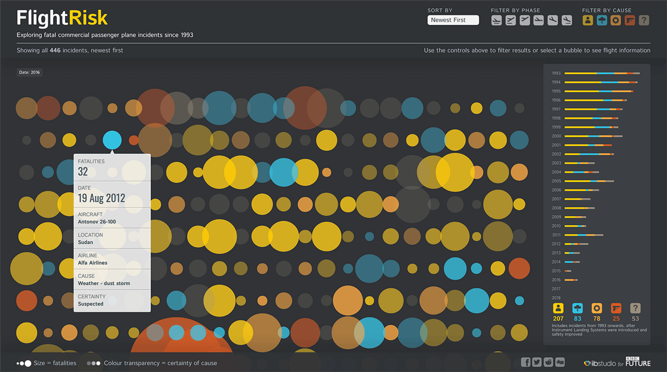
To explore the subject for BBC Future, we looked at every commercial plane crash from 1993 onwards and created an interactive visualization that revealed the patterns and connections hidden in the data.

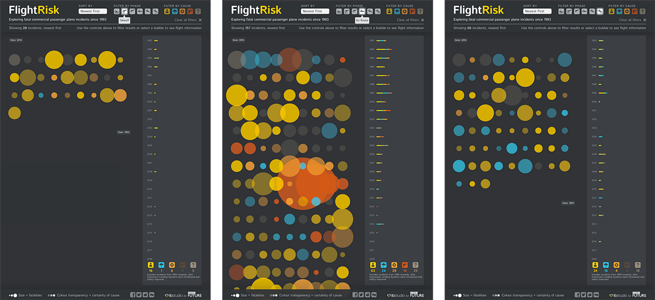
Using the controls, people could filter, sort and rearrange the data by five different causes of incident (for example, ‘Human error’ or ‘Mechanic’) and six different phases of flight (from ‘Grounded’ to ‘Landing’).

We needed to pack a lot of information on-screen. Overlapping bubbles made for an efficient use of space where clicking on a bubble revealed more background information for each incident. such as the type of plane and the country where the crash occurred.

This is a serious subject, but we wanted to offset a sombre background with bold colours that made the experience feel inviting and contemporary. Similarly, we added smooth, organic physics to the movements of the bubbles to provide a pleasing user experience.

Many stories surfaced, but one stand-out narrative was how human error is slowly disappearing thanks to automation. Something that could have interesting implications for the fast-growing driverless car industry.

A proportional area chart showing the deaths per million passenger miles of different modes of transport. The least dangerous is is air at just 0.002 deaths. The most dangerous is sea with 33.47 deaths.
A series of bubbles representing fatal commercial passenger plane incidents between 1993 and 2014. The bubbles are different colours based on the cause of the incident, they are different sizes based on the number of fatalities. One bubble has been selected revealing a box with more information. It shows 32 fatalities, a date of 19 August 2012 along with the location, aircraft, airline, cause and level of certainty.
Three screenshots of the bubbles used on the Flight Risk website. The three screenshots show the page with different filters applied.
Several icons used on the flight risk website They're in the style of airport information signs, simple and clear shapes including planes taking off and landing, a thunderstorm for bad weather and a human outline for human error incidents.

Get in touch:hello@beyondwordsstudio.com

beyond words logo
Follow us
TwitterInstagramLinkedInYouTube
Find us
Beyond Words Studio UK 91 Brick Lane London, E1 6QL
Beyond Words Studio US Florida, USA
Beyond Words Studio EU Dublin, Ireland
Copyright Beyond Words Studio Ltd. 2023