That answer to all of the above questions is the same: far fewer than we could have said two decades ago.
The Bill & Melinda Gates Foundation wanted to create a special report to celebrate the amazing progress that’s been made on the UN global goals over the past 25 years and inspire leaders to keep going.
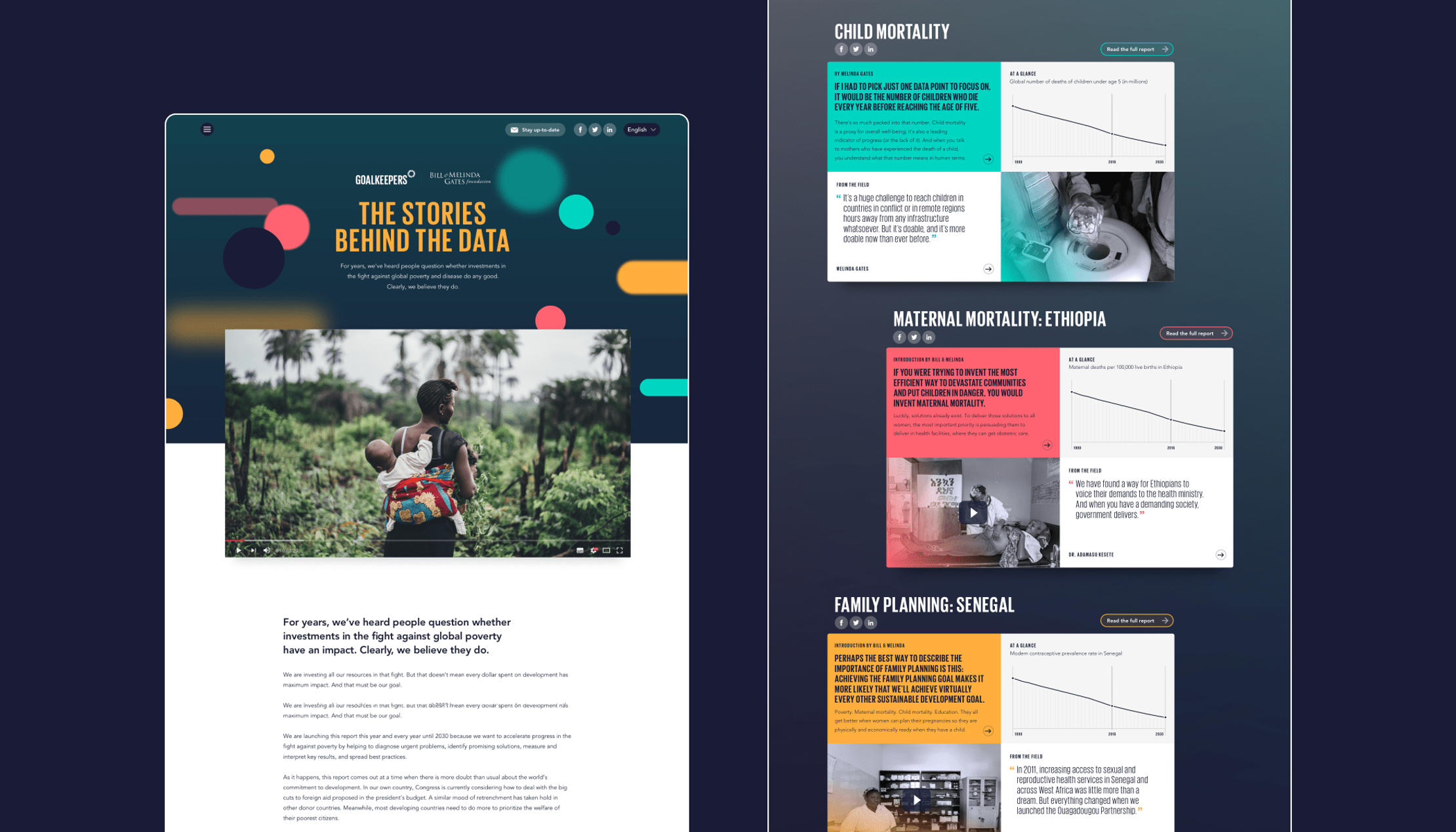
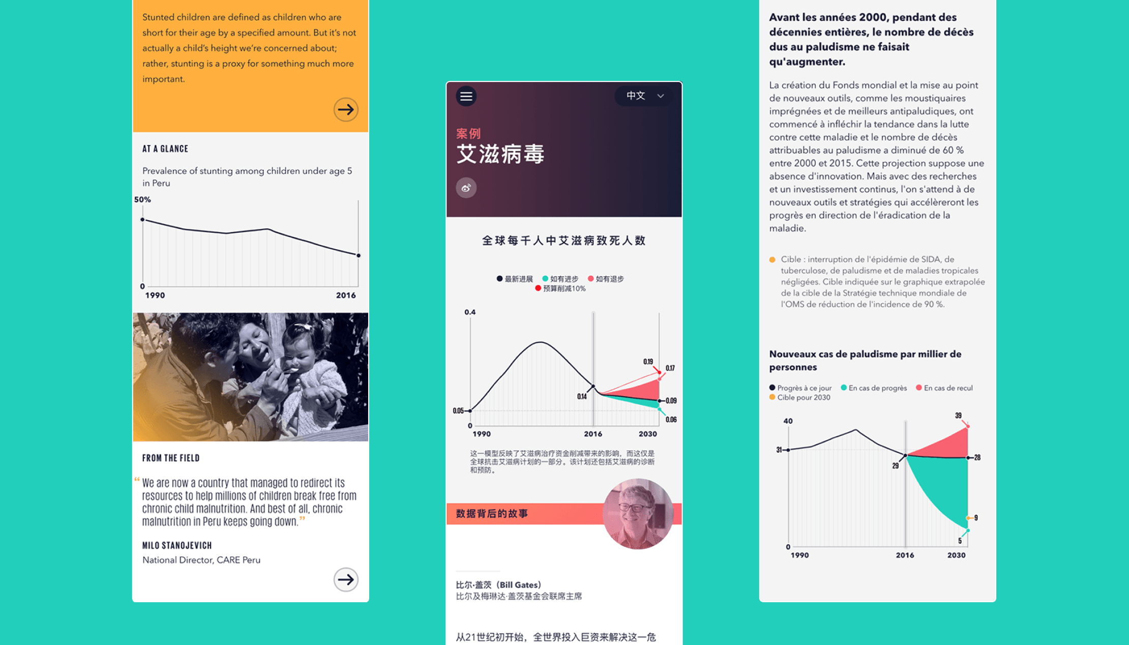
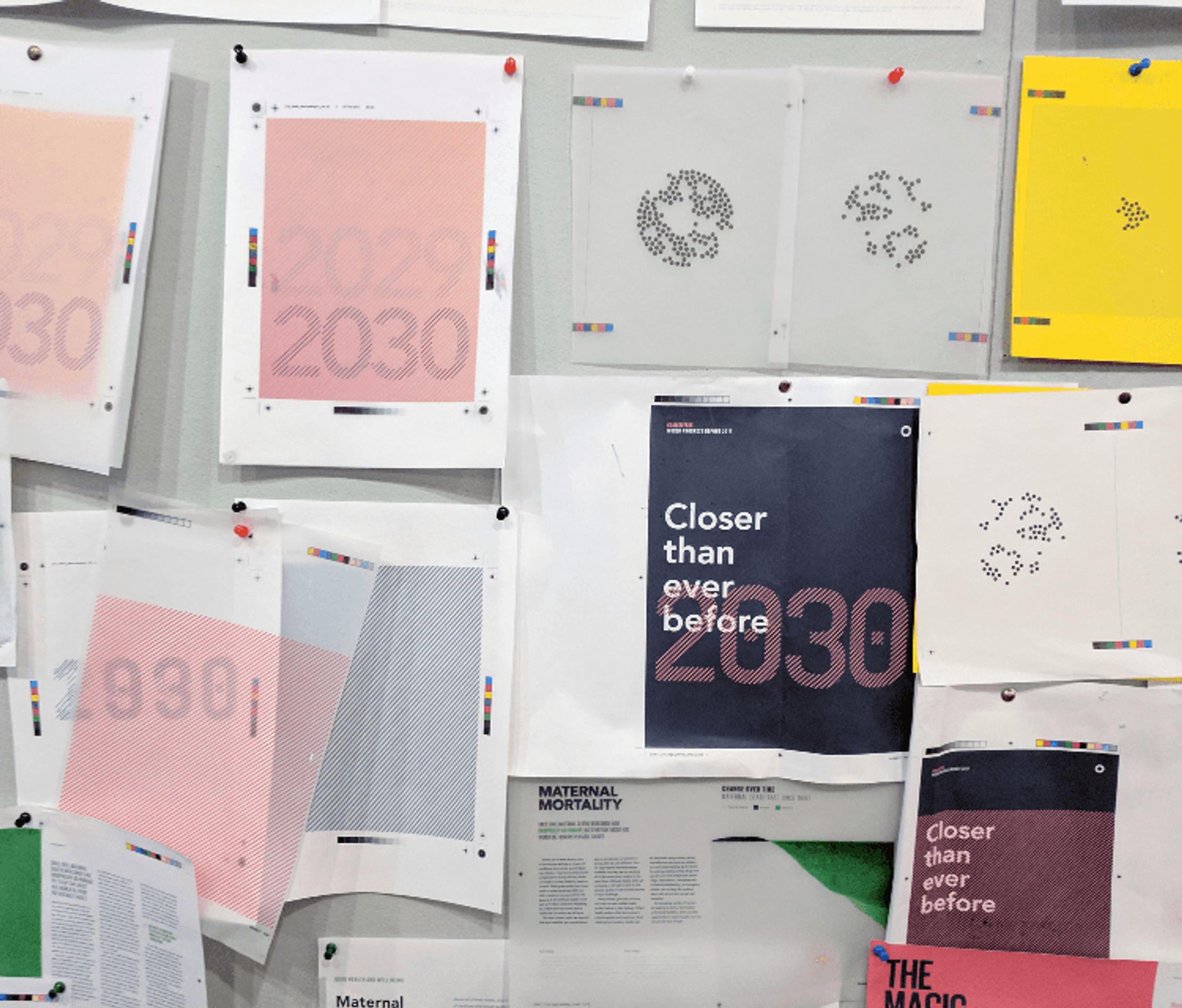
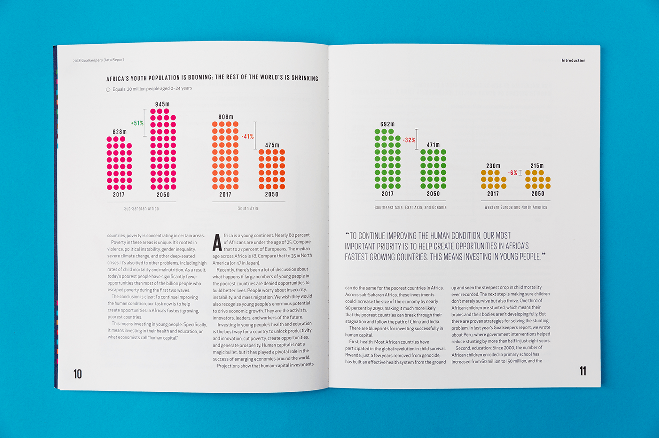
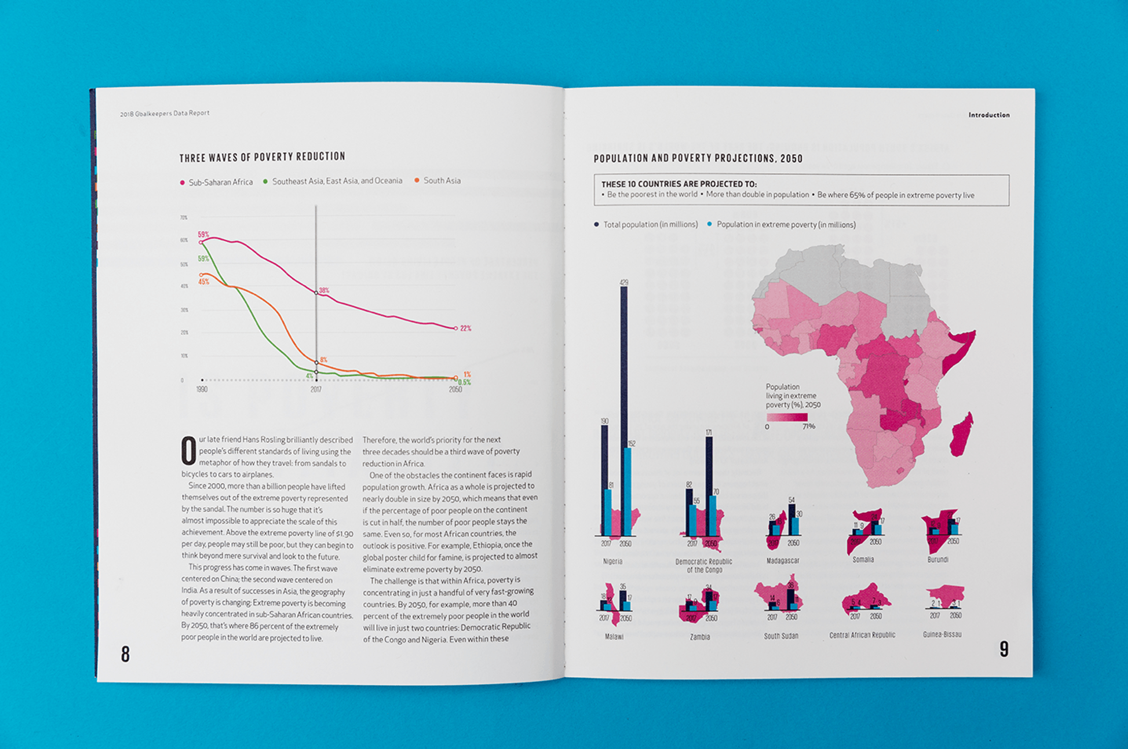
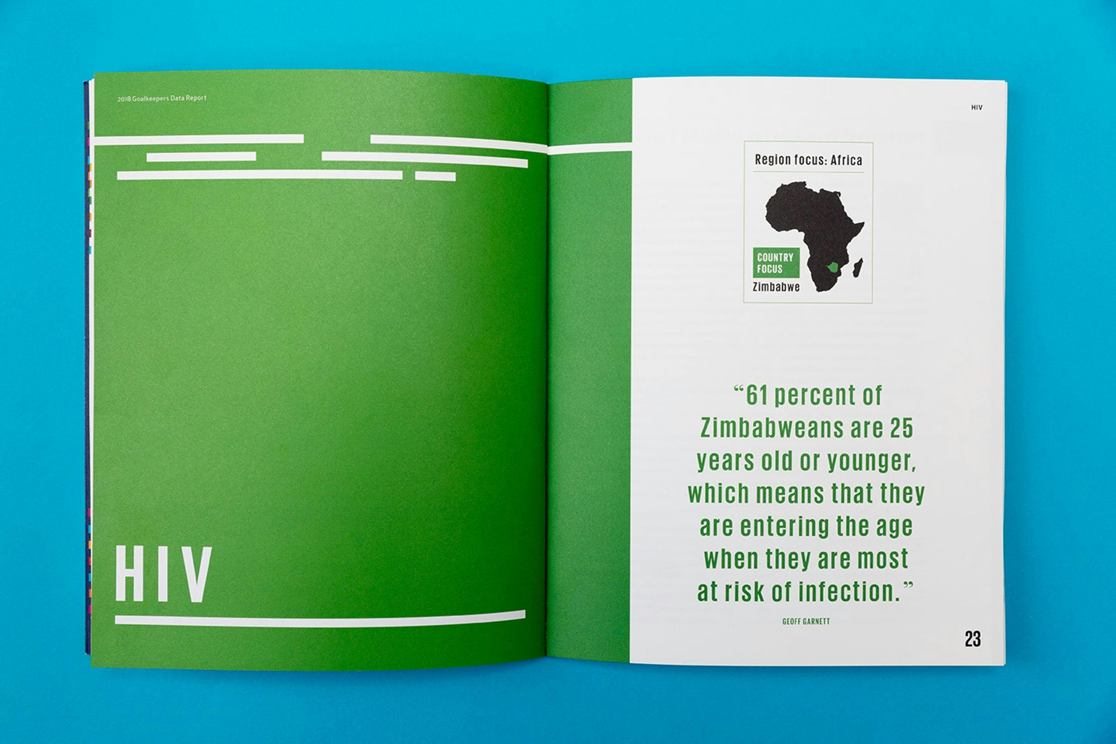
There are 18 Sustainable Development Goal key indicators covering everything from HIV to maternal mortality between 1990 and projections for where we might be in 2030.
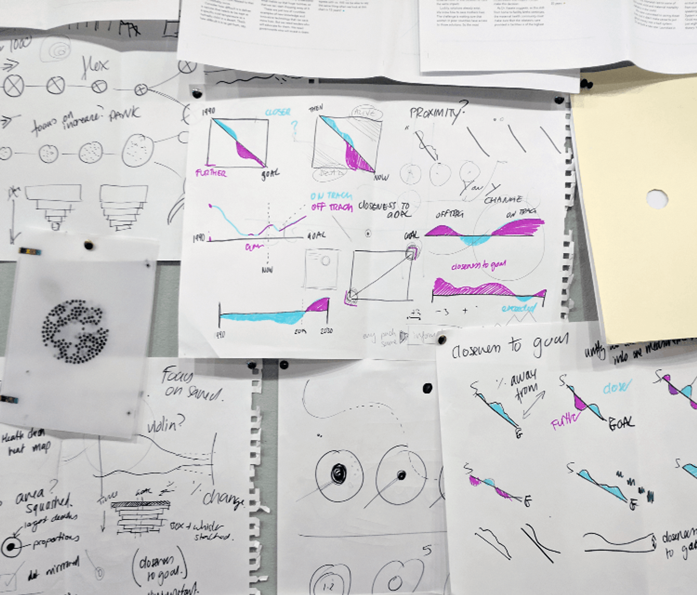
It’s a serious amount of data. So we streamlined our stories into sleek and simple line charts that could deliver an unmistakable message to policy-makers: “We have made amazing progress, but more needs to be done.”
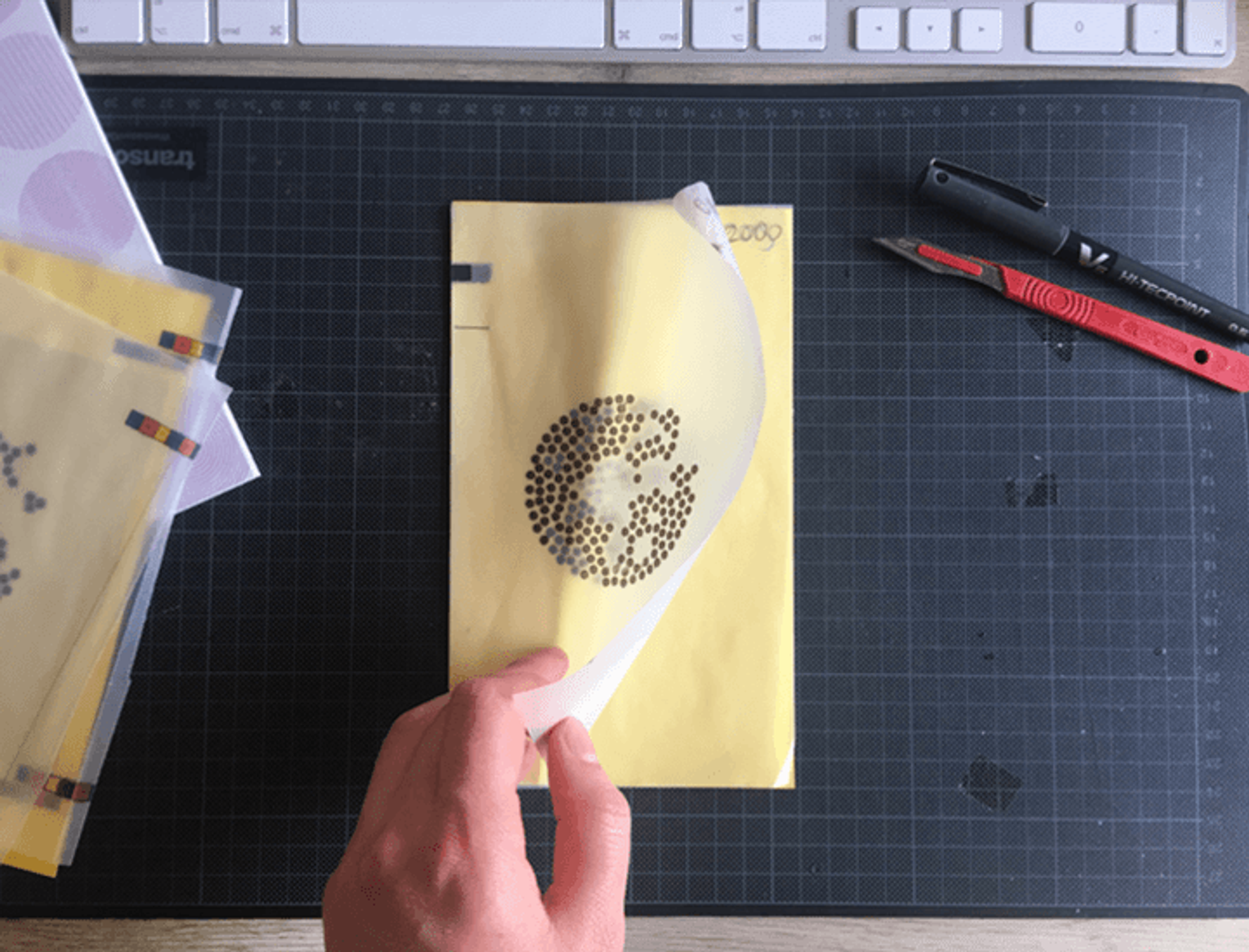
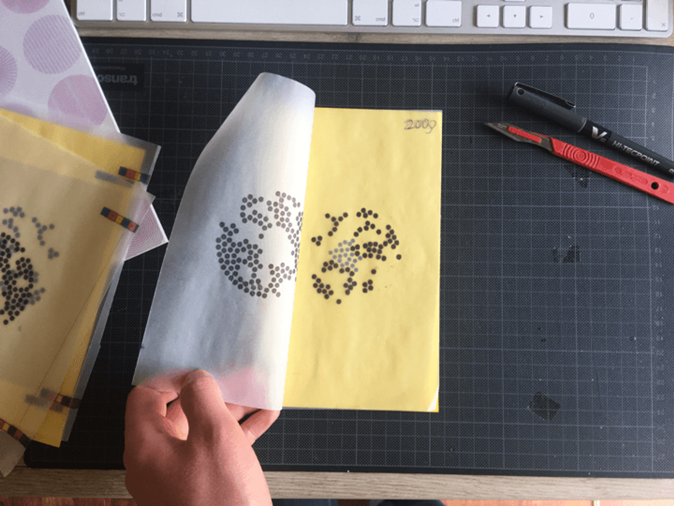
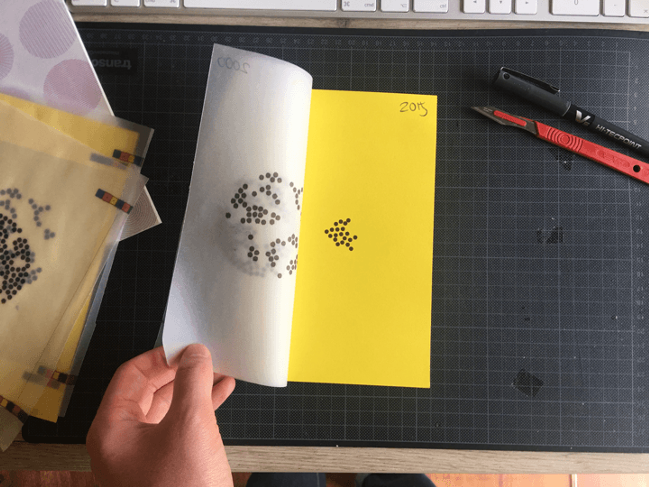
The report would be both printed and digital, so we developed a flexible and familiar visual language for readers. Careful use of vibrant colours showed how much progress could be made – or lost – in the next decade. And annotations called out helpful key points in the story.
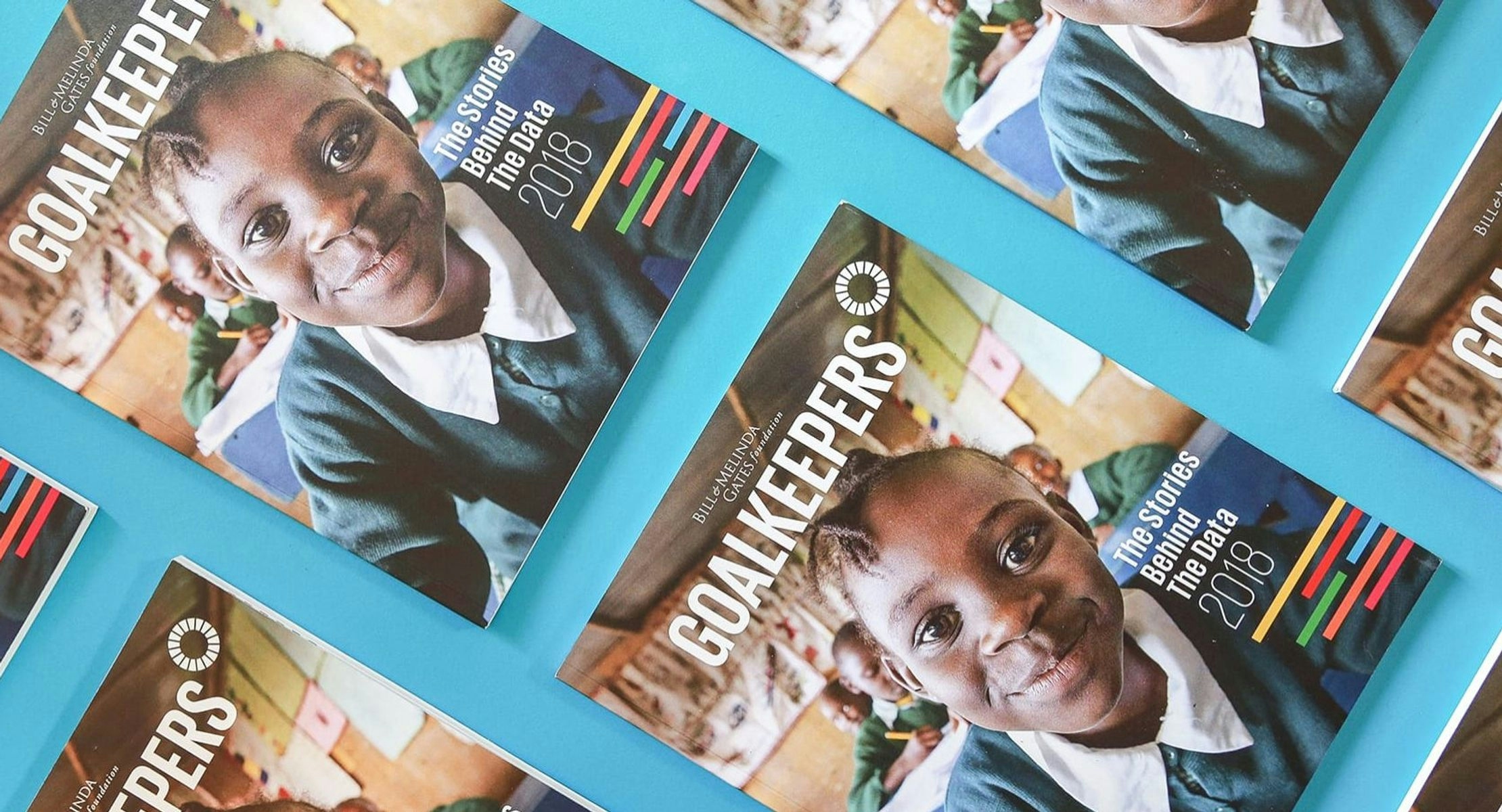
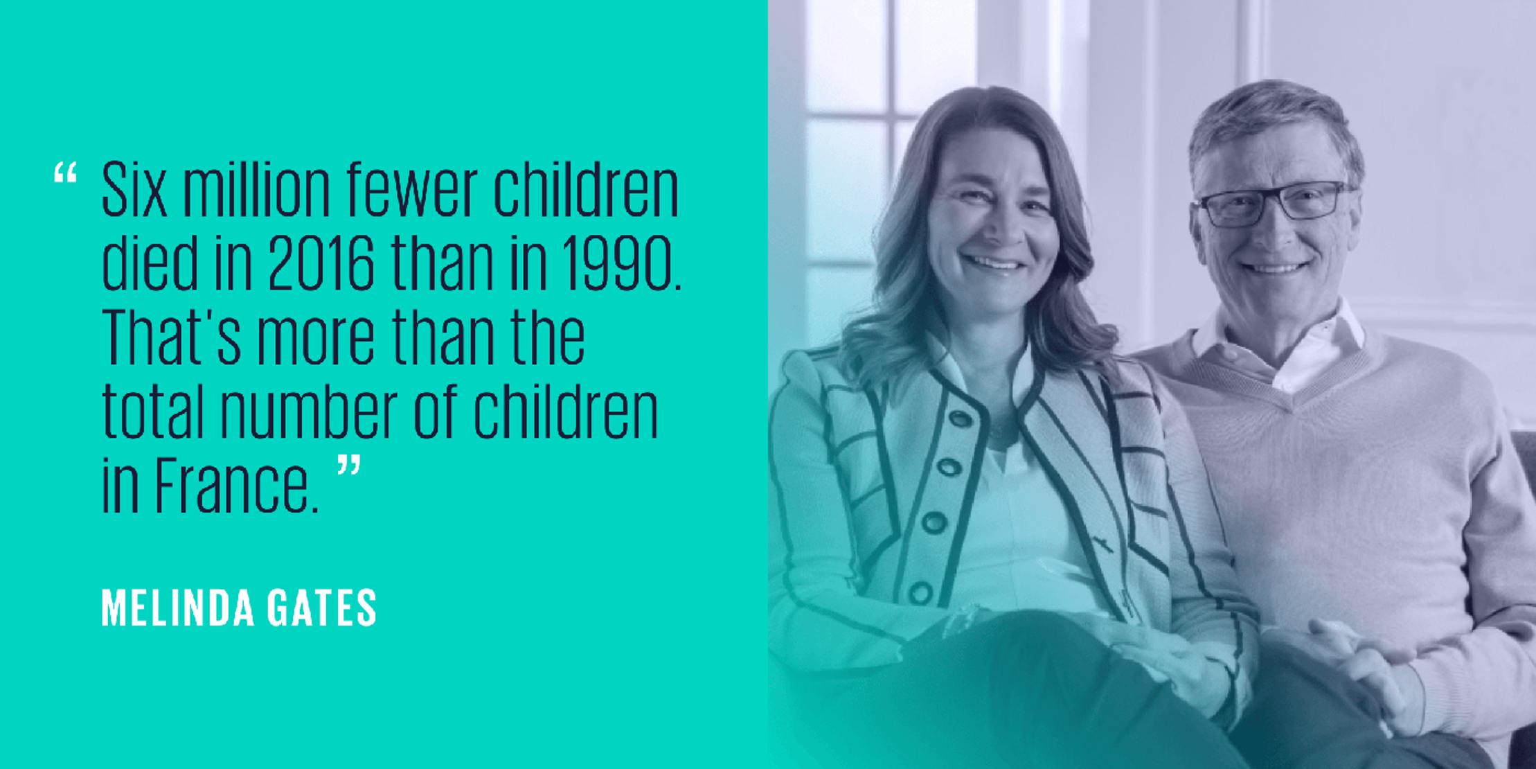
The final 40-page booklet was built around these visualizations, pairing them with essays written by Bill and Melinda, and in-depth case studies from experts in the field.
But the report also needed to reach a much wider online audience, so we translated the printed report’s full content into an elegant website, available in seven different languages and on any screen size.
To help promote the launch of the report on social media, we transformed four of the most powerful charts into mini video-stories. On a wider level, we also helped put together the media package for the UNGA’s international market.
‘Goalkeepers: The Stories Behind the Data’ launched in September 2017 and had a huge impact on audiences around the world, being shared by Nobel Peace Prize-winners, agenda-setting media outlets like Fast Company, and of course, Bill and Melinda themselves.
We would return to the work a year later for Goalkeepers 2018, redesigning the report with a fresh emphasis on giving it a human touch.
Get in touch:hello@beyondwordsstudio.com

These dynamic big-screen presentations helped Bill Gates to deliver an annual speech that’s designed to change the world.

An illustrated, approachable digital summary of the World Bank's 350-page development report.