Totaljobs
For job-hunting experts Totaljobs, we transformed a survey of more than 5,000 UK workers into a compelling B2C digital interactive that would spark media coverage, drive traffic and get people talking about co-worker couples.
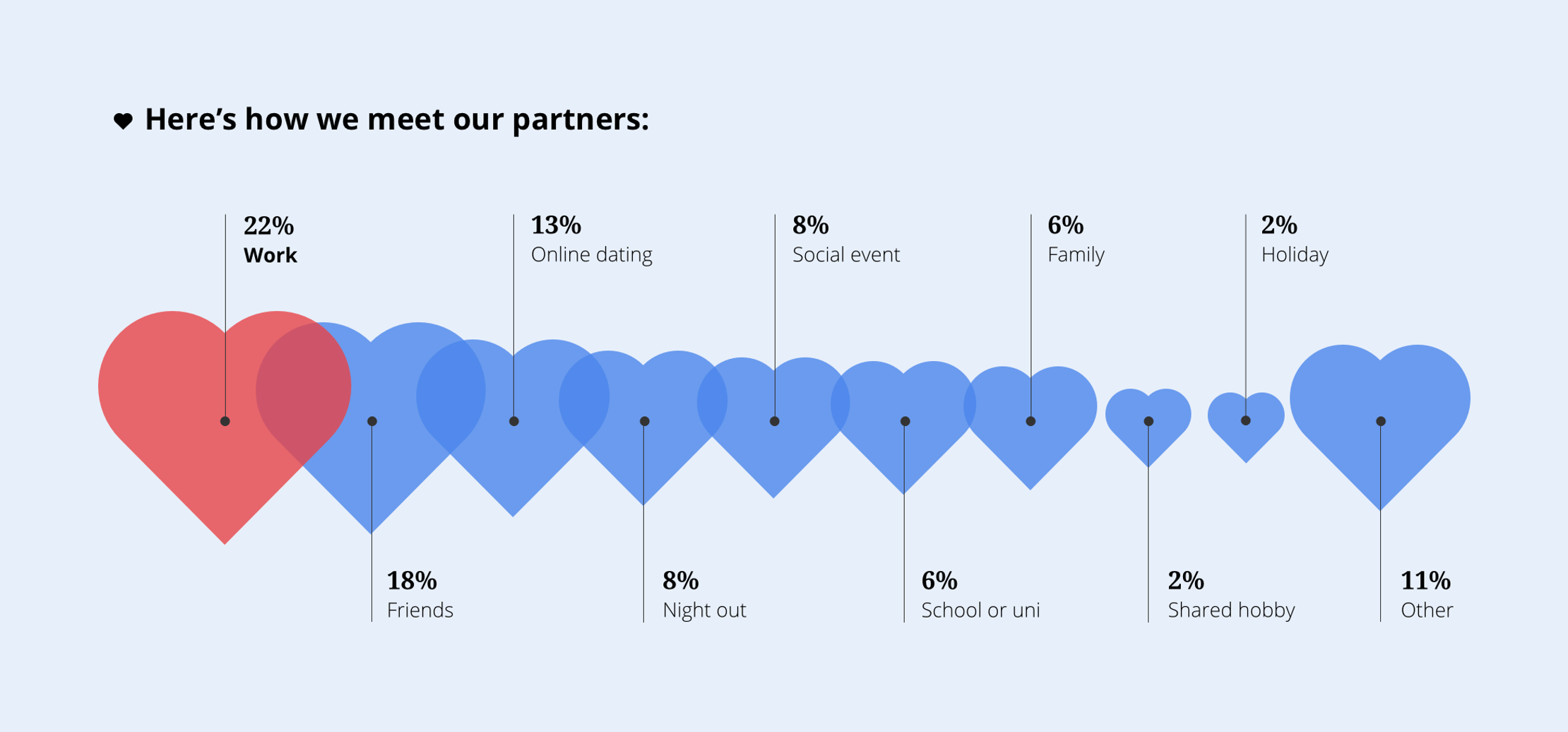
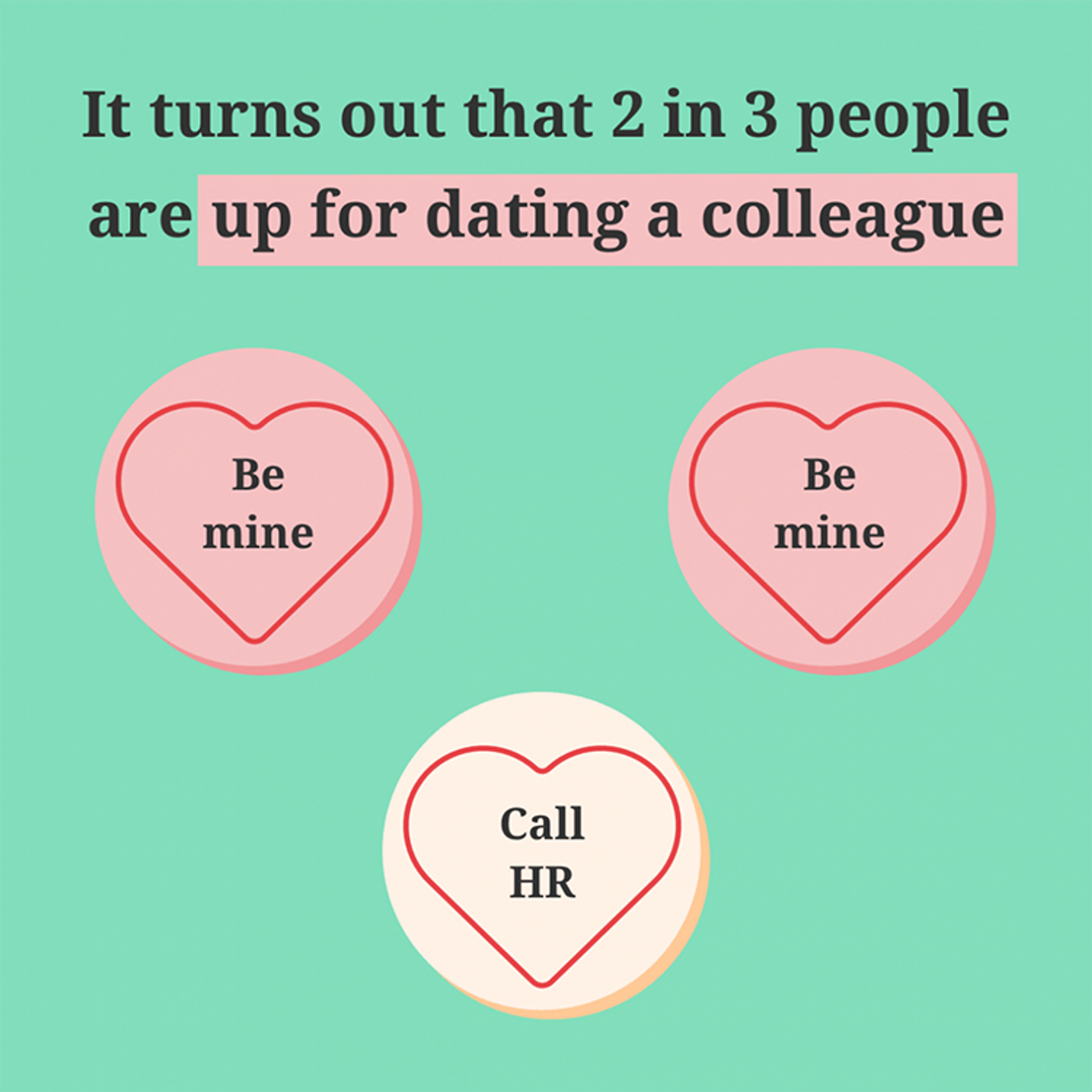
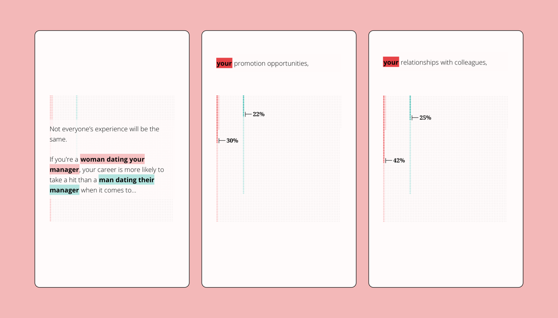
We analysed this fascinating data set and built the narrative from the best stories we discovered within it. Like how the leisure and recreation industry had the most people open to dating a colleague. Or how almost no one tells HR about blossoming romances.
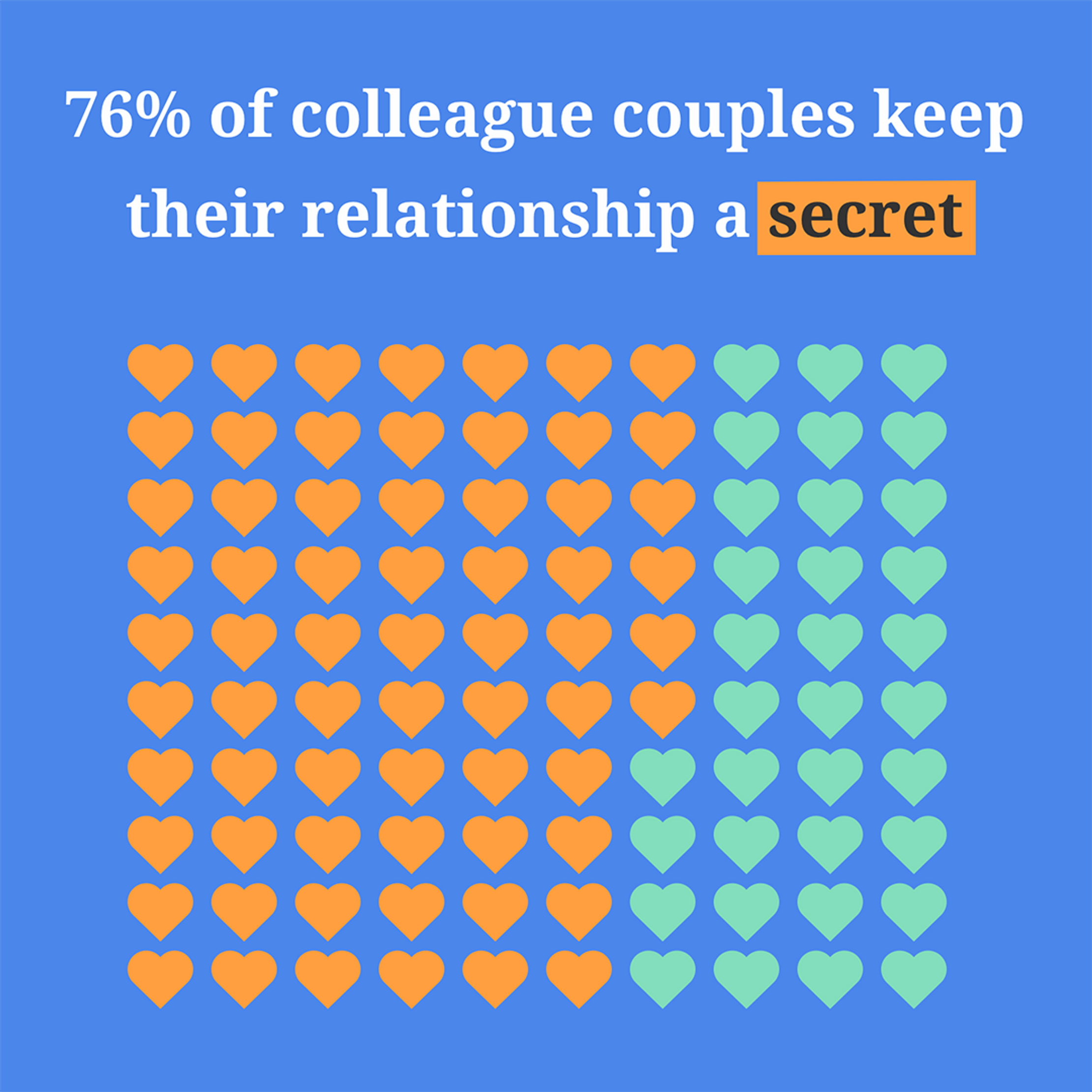
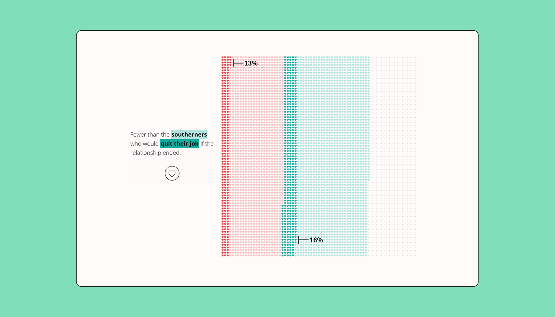
Inspired by FiveThirtyEight’s Gun Deaths in America, we included a waffle chart that captured every individual story and presented the data as transparently as possible.
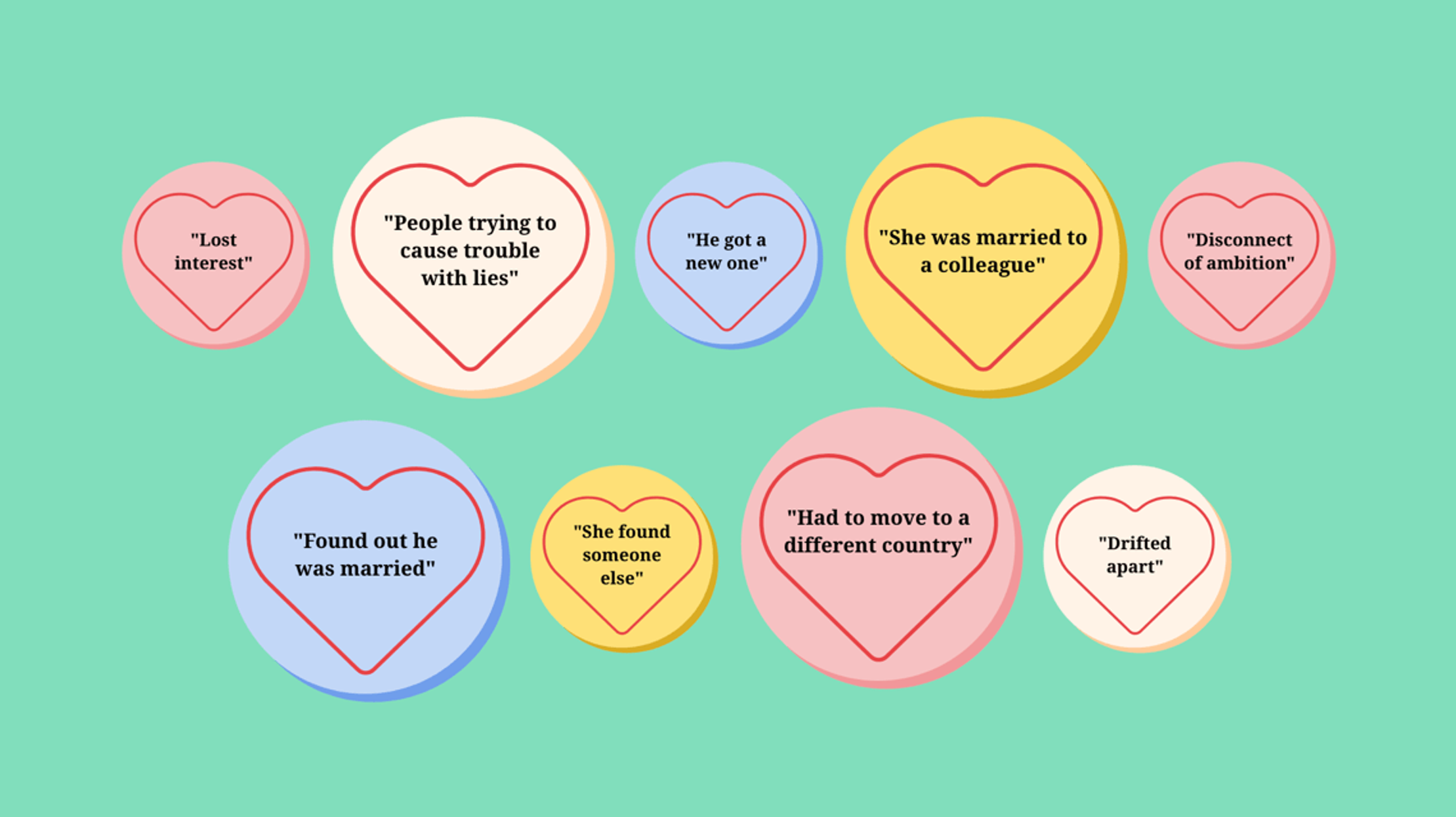
The iconic ‘Love Hearts’ confectionery lent a sweet visual motif and we added a fun workplace twist to the messages: “Firefoxy lady”, “Outlook me up”, “Lose CTRL” to name a few.
From the click-through arrows shaped like hearts (which ‘beat’ when tapped) to the survey’s most amusing reasons for failed romances (“He got a new one”), there were plenty of opportunities to fill this data-driven story with moments of delight.
Get in touch:hello@beyondwordsstudio.com

Packed with dynamic visualization, this scrolling editorial story explores why and how we fall out with our work colleagues.

The UN Foundation asked us to tell the remarkable story of the second biggest single contributor to WHO's pandemic response.