Nature: Liberated by Lockdown?

We delved into data to reveal what happened to the natural world while humans were locked down by COVID-19.
Client

Natural History Museum

A collage of different UK wildlife drawings from the the Natural History Museum's collection. It includes squirrels, mice, insect, leaves and a bird of prey.

From whales singing over the sound of ships to sheep learning to use a children’s roundabout, COVID-19 opened up the natural world in ways we haven’t seen before.

In this science-saturated, illustrated article for the Natural History Museum, we explored the data behind nature’s response to lockdowns.

Funded by the Natural Environment Research Council, this piece had to inspire the public’s curiosity and crowdsource questions for researchers.

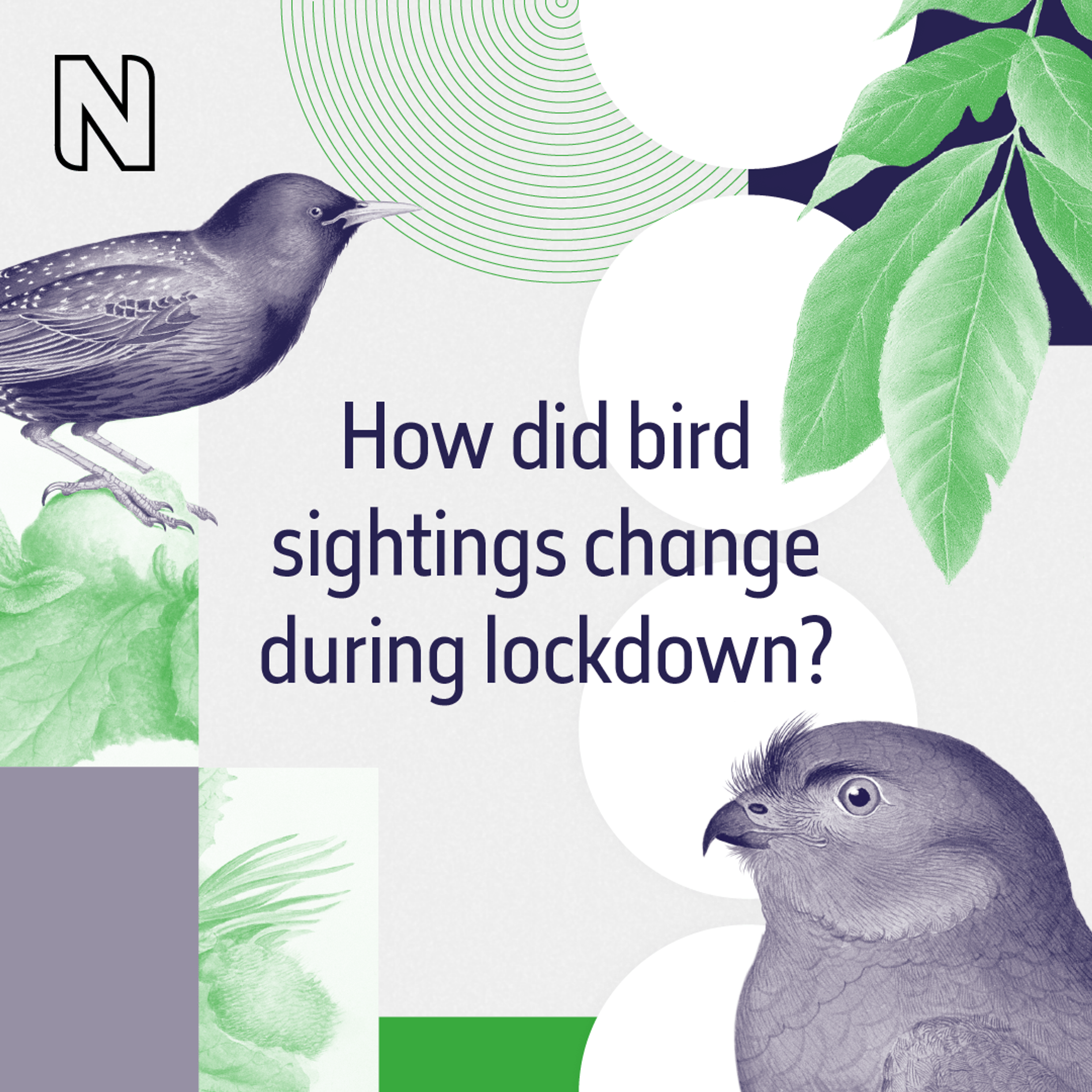
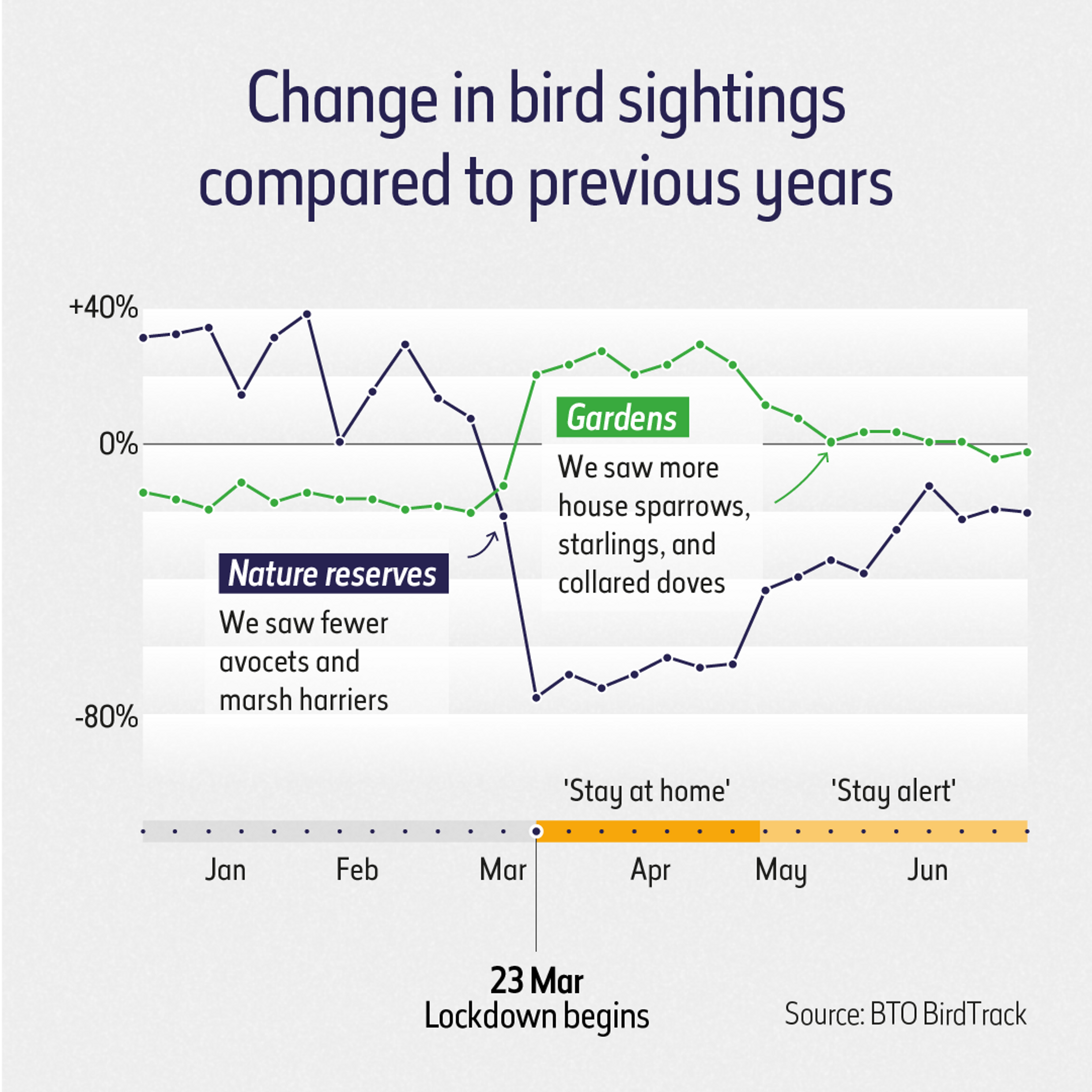
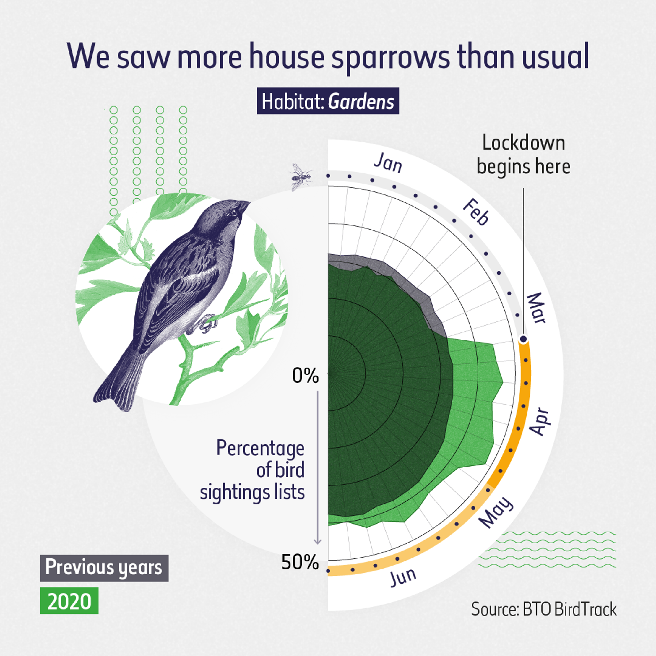
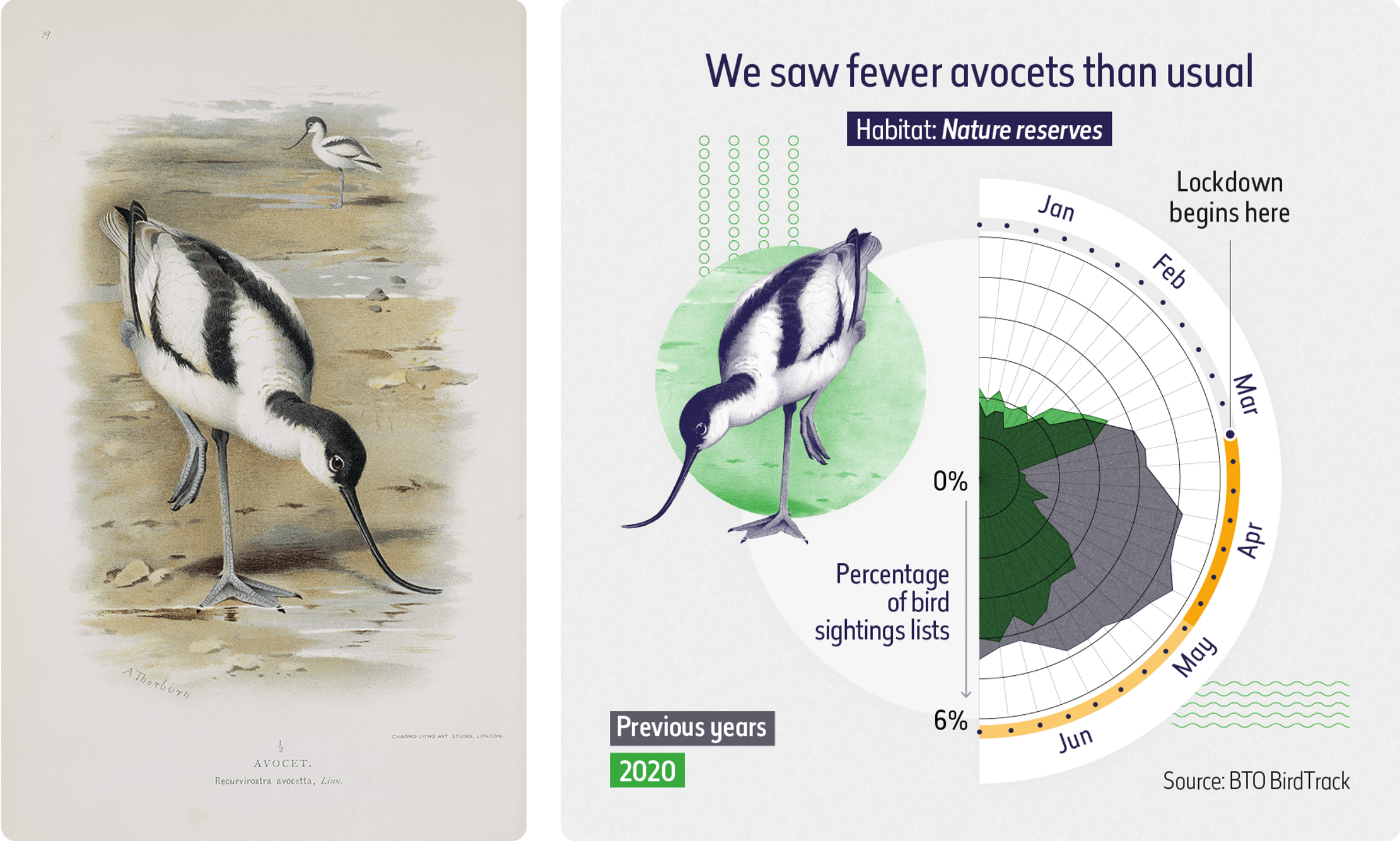
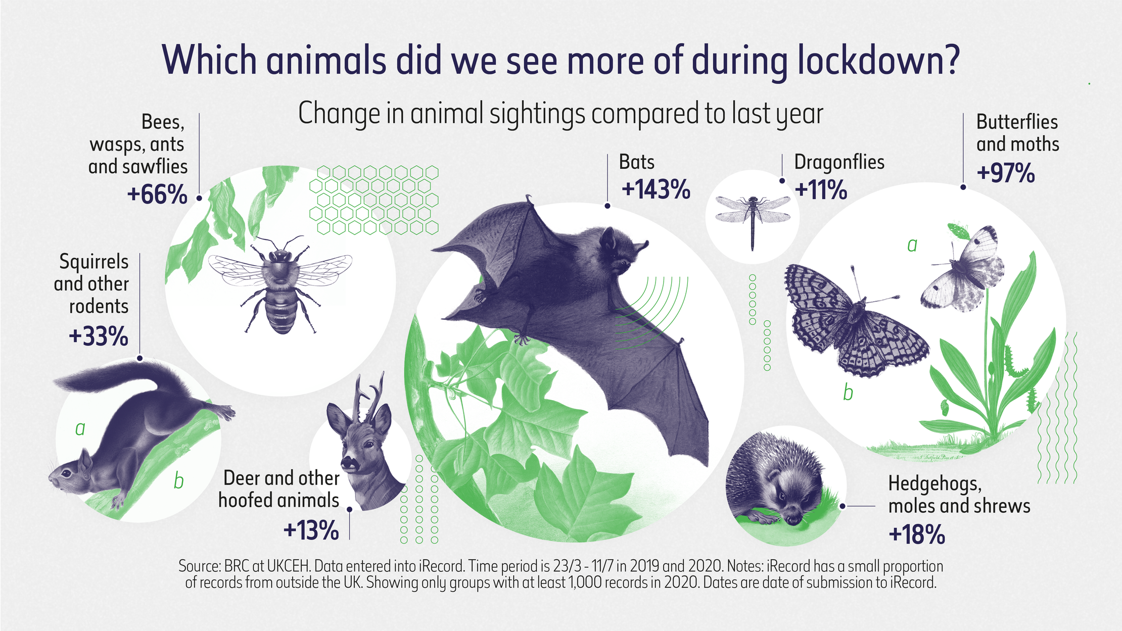
We learned as much as we could about air pollution, animal sightings, ground vibrations, bird habitats, mammal taxons and transport data and used a variety of chart types and annotations to represent them.

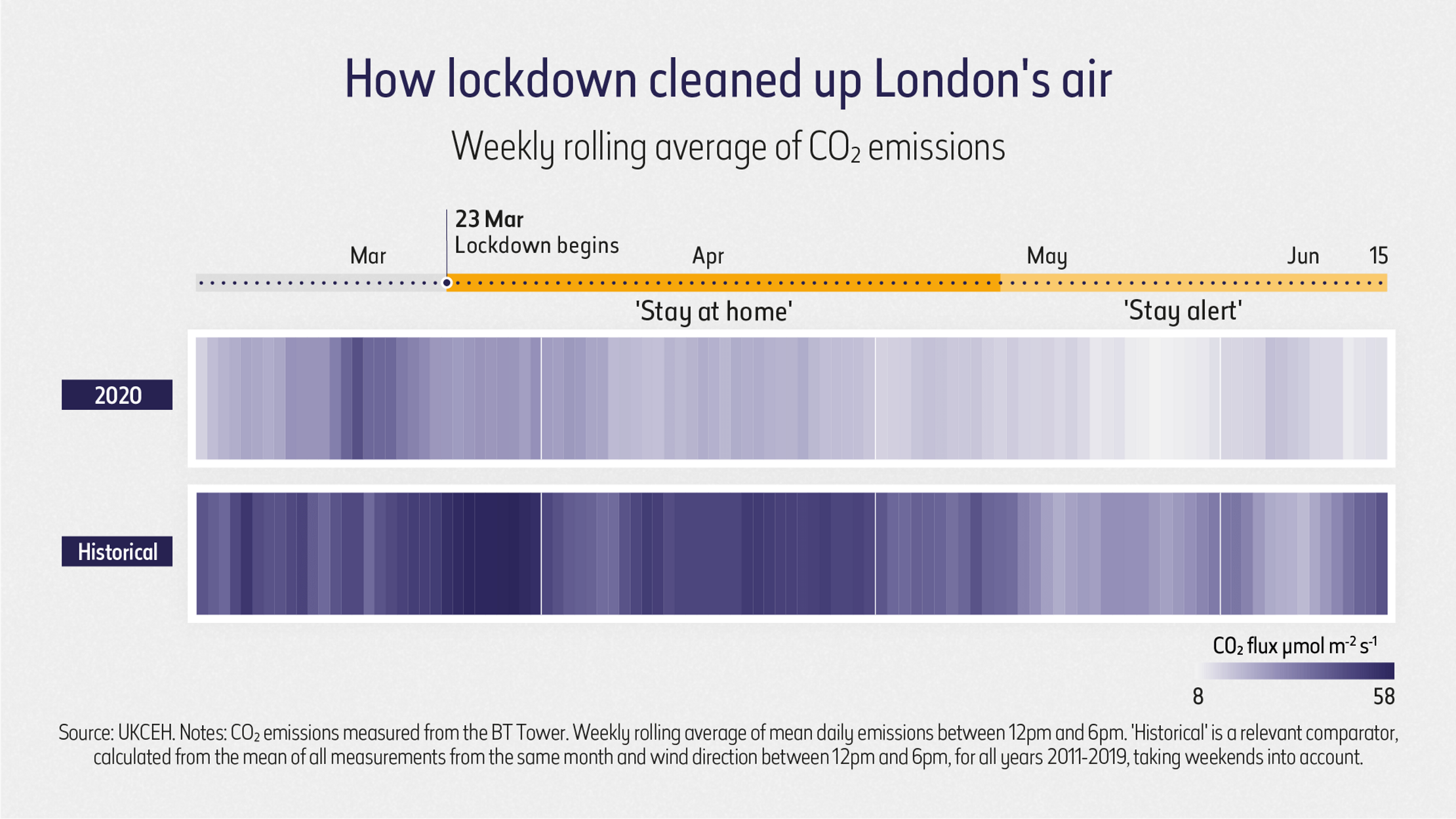
A heat map showing air quality evoked the idea of pollution, while illustrated bubbles communicated how many bees, bats and butterflies we saw in 2020 compared to 2019.

We know the days at home blurred into one, so we added a lockdown timeline to the time-series charts – a useful reminder of where we were on the lockdown scale and a visual link between different visualizations.

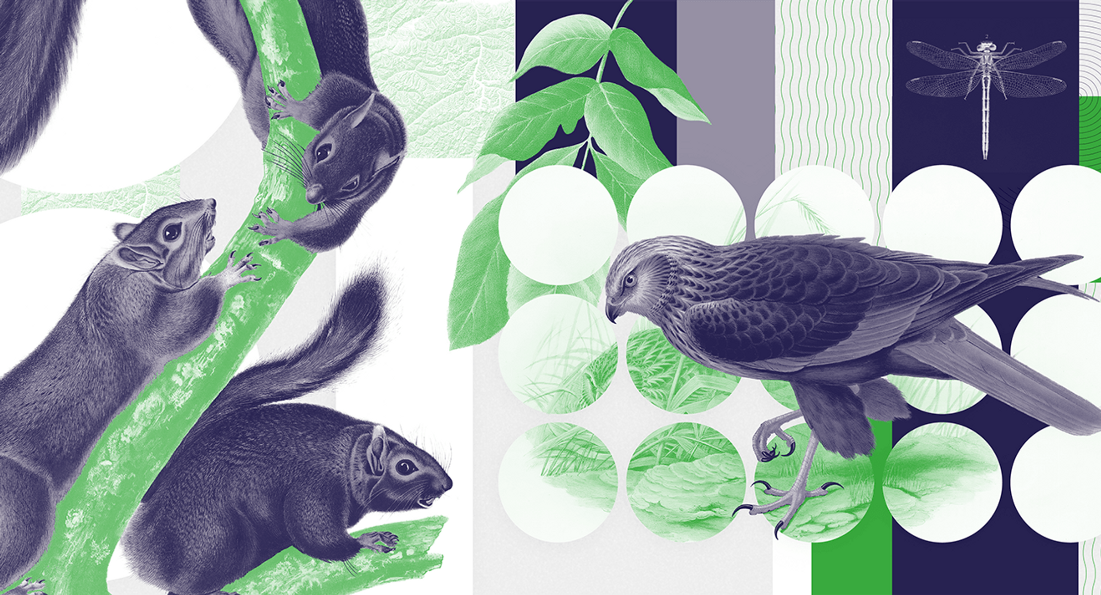
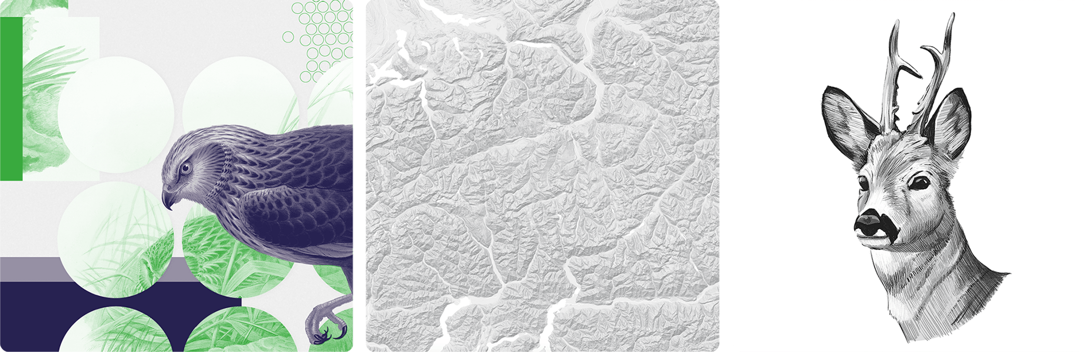
And to fit with the museum’s iconic aesthetic, we (literally) drew on their rich library of biological drawings.

The final piece flourished online and also sparked discussion at a live interactive virtual ‘Lates’ event about Nature in Lockdown.

A square graphic with the text 'How the UK went quiet during lockdown.' It includes the logo for the Natural History Museum, a map, leaves, topography and other collaged graphics.
A square graphic with the text 'How did bird sightings change during lockdown?' It includes two illustrations of birds from the Natural History Museum's image library. Other collaged graphics include leaves and circles.
A data visualization showing a year of CO2 emissions in London. The two CO2 stripes show historical data versus 2020. The plots show London's air was noticably cleaner in 2020. A timeline above the stripes marks when different lockdown levels were in affect.
A line chart showing how bird sightings changed in 2020. It shows sightings on nature reserves fell as lockdown began and garden recordings for birds like sparrows and starlings increased.
A radar chart showing the percentage of bird sighting lists noting sparrows, which are typically seen in gardens' in the first half of 2020. It shows a significant spike as UK lockdowns began in March 2020.
A series of graphics used in the Nature: Liberated by Lockdown project. It includes topography of a hilly landscape, a sketch of a deer and an illustration of a bird and  leaves.
A radar chart showing the percentage of bird sighting lists noting avocets, which are typically seen in Nature reserves' in the first half of 2020. It shows a significant drop in sightings compared to previous years, especially in March and April 2020 when UK lockdowns first began.
A circular proportional area chart where each circle shows the percentage change in animal sightings in 2020 compared to the previous year. It shows sightings of several animals increased with the biggest increase being in bats at +143%.

Get in touch:hello@beyondwordsstudio.com

beyond words logo
Follow us
TwitterInstagramLinkedInYouTube
Find us
Beyond Words Studio UK 91 Brick Lane London, E1 6QL
Beyond Words Studio US Florida, USA
Beyond Words Studio EU Dublin, Ireland
Copyright Beyond Words Studio Ltd. 2023