Bill & Melinda Gates Foundation
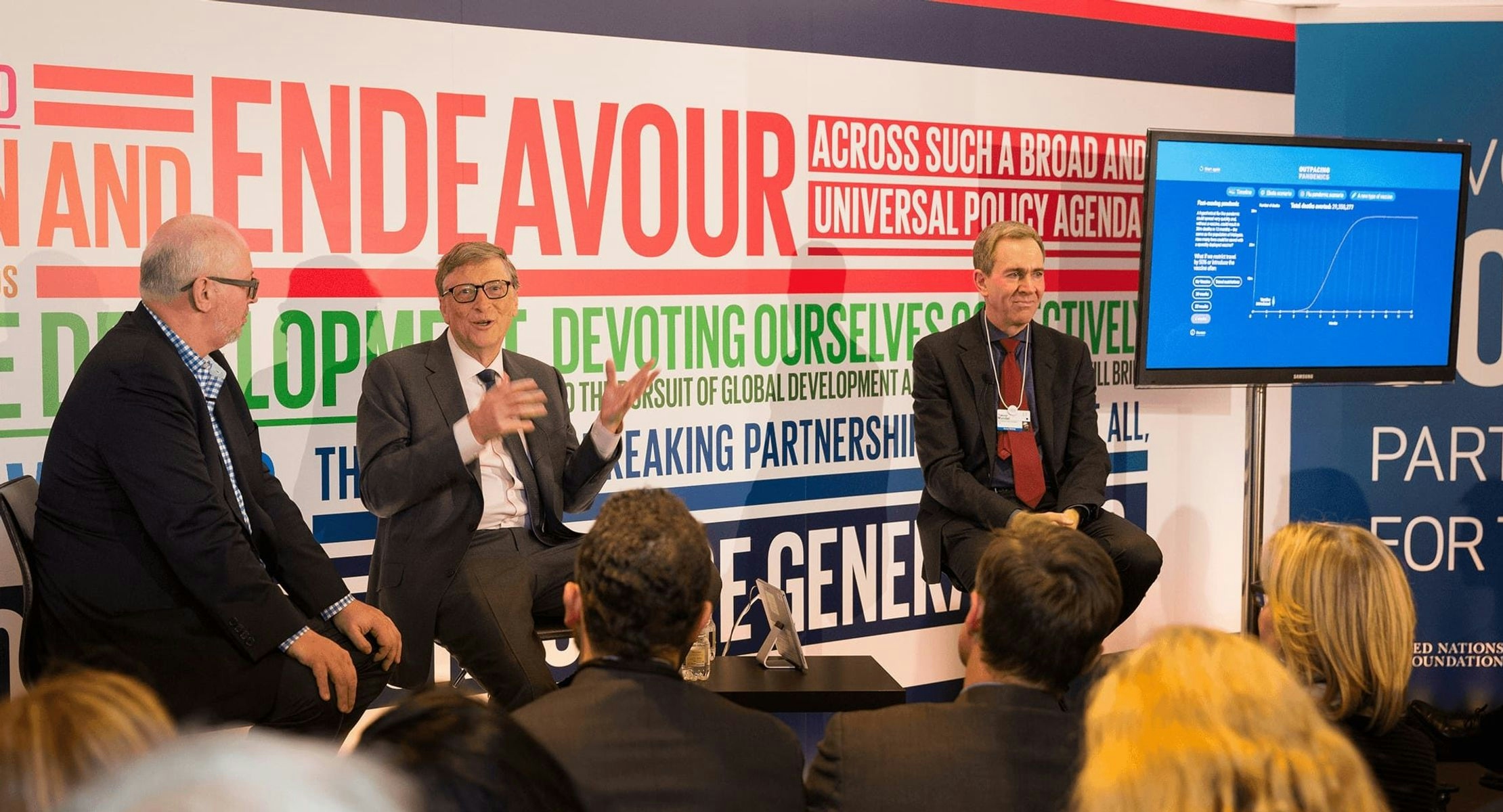
This was the message Bill Gates was presenting to the World Economic Forum in 2017. So we produced a startling interactive data visualization to support his speech.
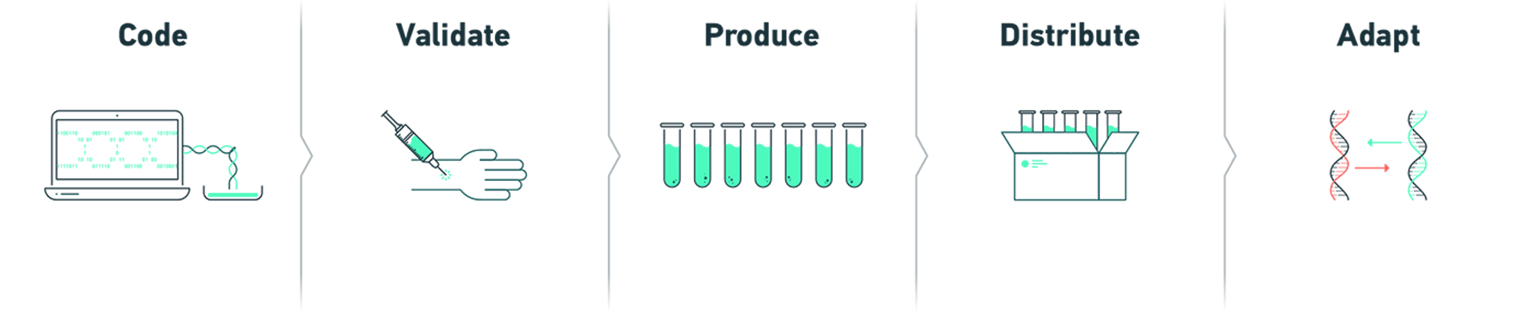
Vaccine development is complex, so we broke it into simple steps: Code, Validate, Produce, Distribute, Adapt.
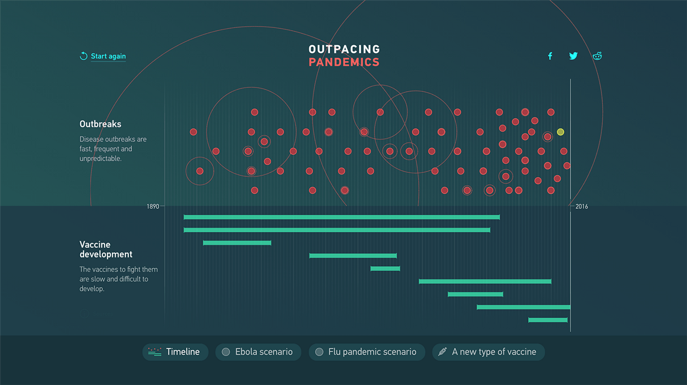
Using a split-screen device on a timeline spanning from 1899 to 2016, readers could compare the frightening rate of nearly 70 outbreaks against the slower-moving development of their vaccines.
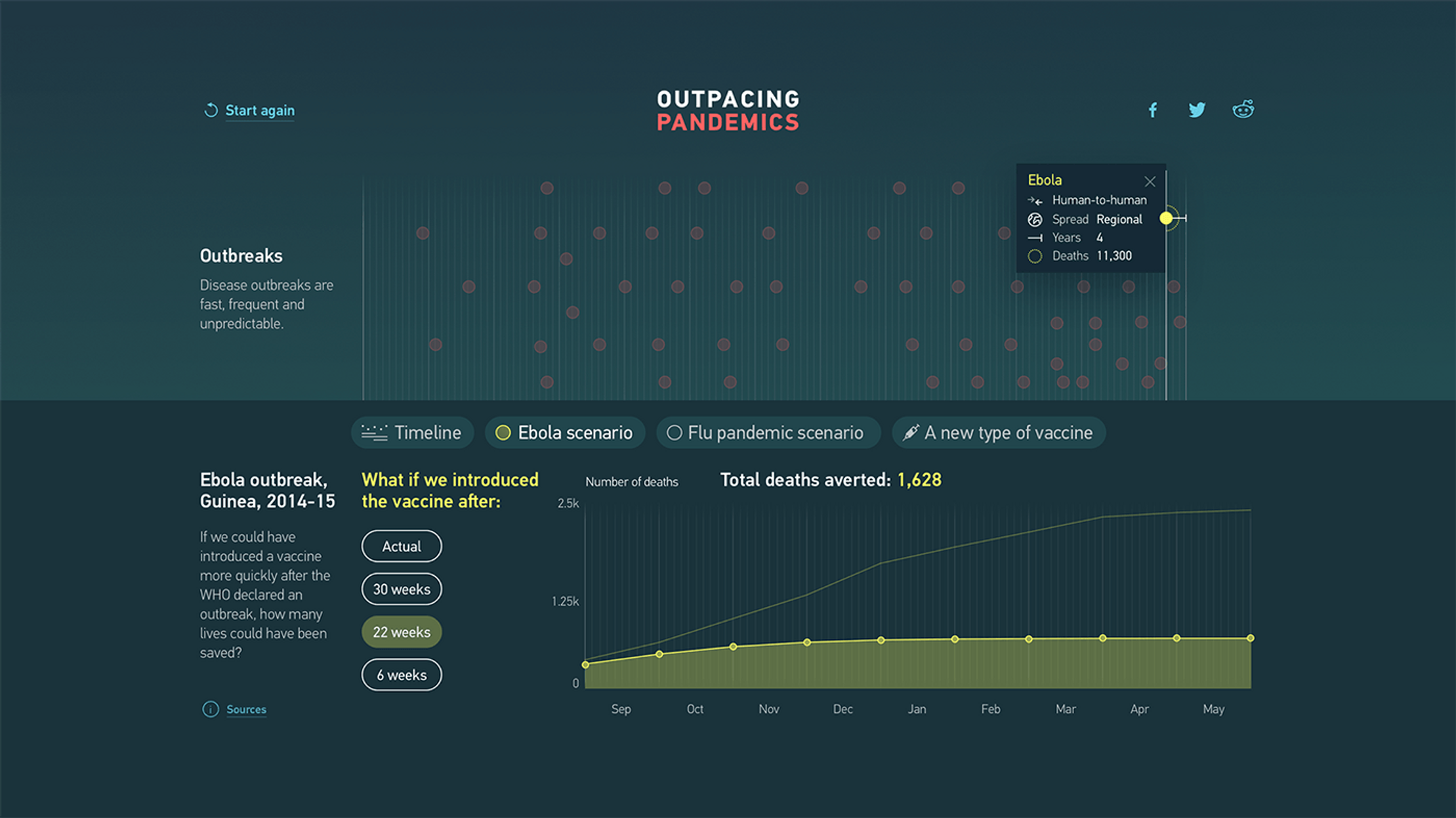
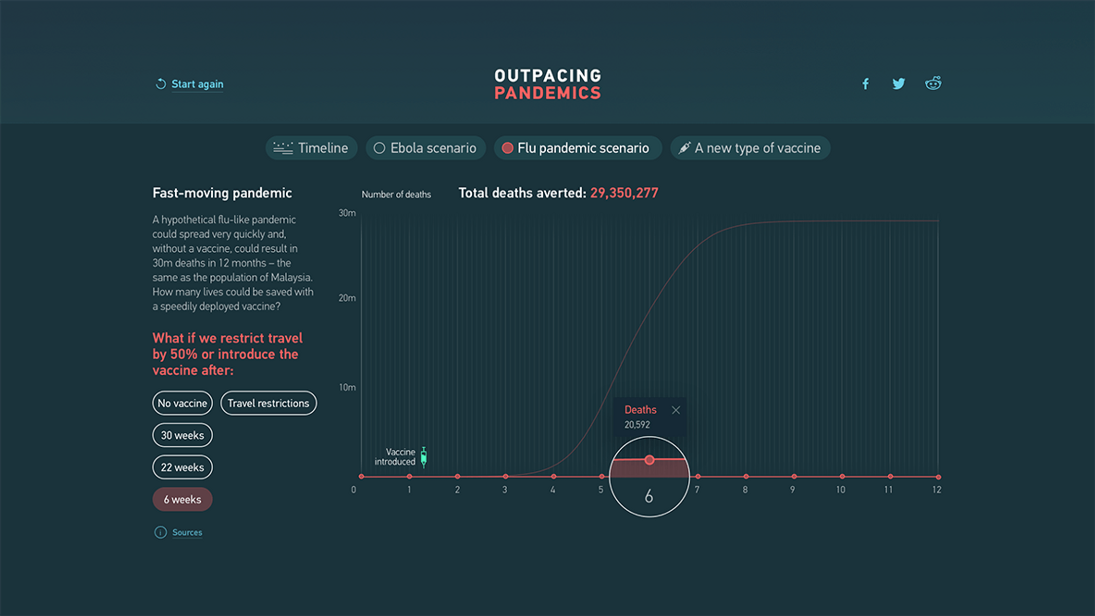
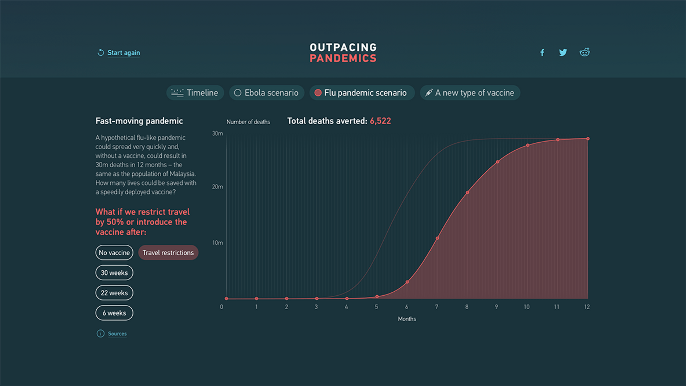
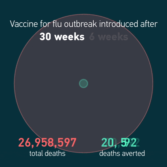
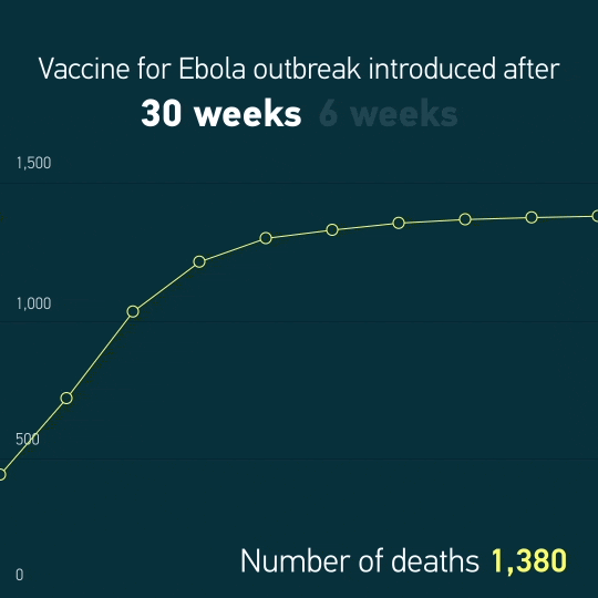
We also provided two outbreak scenarios – Ebola and Flu – comparing how many lives would be saved if vaccines were developed sooner.
Working closely with experts at the Gates Foundation, the University of Florida and the Institute for Disease Modeling ensured our hypothetical scenarios were realistic.
The Gates Foundation wanted vaccines to go viral, so we provided some punchy, looping animations to promote the upcoming speech on social media.
After Bill Gates' presentation of Outpacing Pandemics at Davos, the piece was displayed in the Guggenheim Museum. People were free to explore the stories and visualizations on tablets, making the story all the more contagious.

Get in touch:hello@beyondwordsstudio.com

These dynamic big-screen presentations helped Bill Gates to deliver an annual speech that’s designed to change the world.

The UK Centre for Ecology and Hydrology asked us to create a set of videos to reveal some of the insights within their data.