Social media storytelling

From snappy copy to eye-catching animations, we help clients' stories become sharable social assets that grab audience attention.
Client

Various clients

Project TypeSocial media
A collage of different social media work across several Beyond Words projects.

Social media offers many powerful ways to reach audiences. Here’s how we create data-driven visual stories to engage people in their social feeds.

Charts that unfold

To grab people’s attention on social, we transformed charts from a printed report into short video stories.

In less than 20 seconds, they show progress made on maternal mortality – and how many lives could yet be saved or lost.


Emotion in motion

Designed to stop people as they scroll through their social feeds, this one-minute animation uses a collage of different media – photography, text, graphics and data visualization – to build an emotional, dynamic visual story.


Dynamic talking points

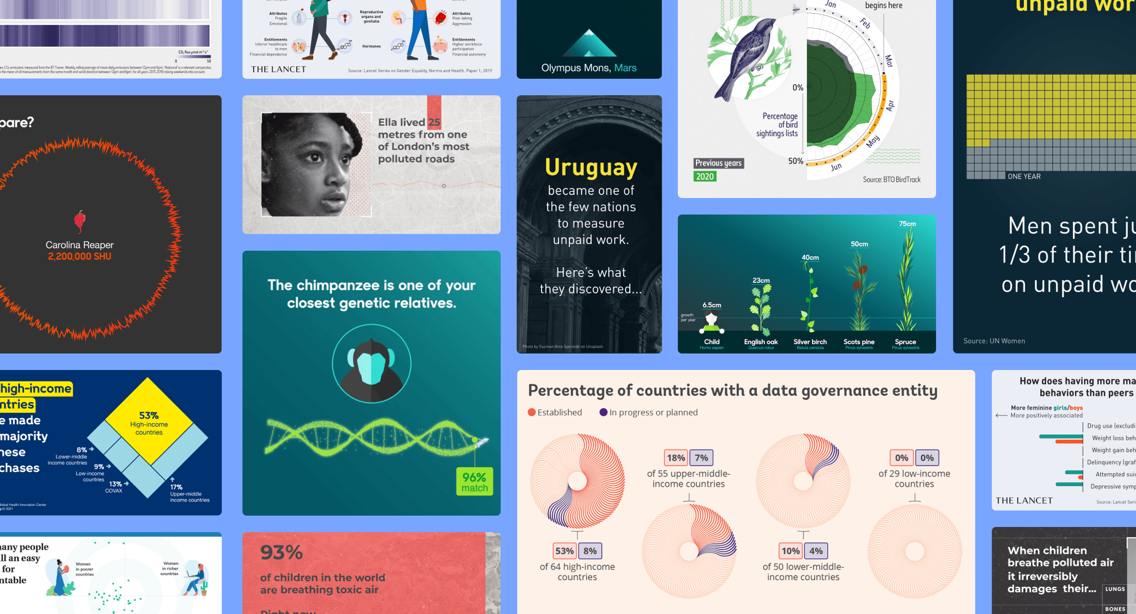
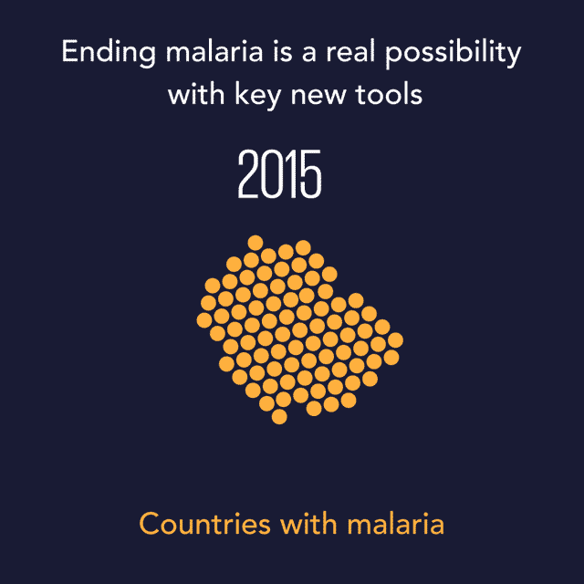
Looping over just a few seconds, these animated gifs offer punchy snapshots from one of Bill Gates’ speeches about malaria.

Fresh, informative and easy to understand, they helped promote the main talking points on social media.

An animated GIF showing countries where malaria is prevalent dwindling from 2015 onwards, disappearing entirely by 2040.
An animated graphic introducing some of the new tools helping to end malaria. It includes drugs that overcome resistance, bed nets and vaccines, single-dose treatments and smart data and analytics.


Delightful discoveries

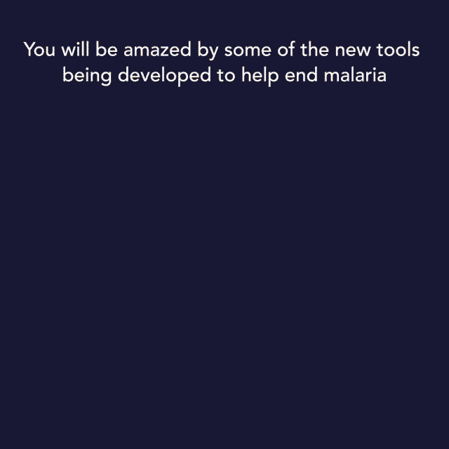
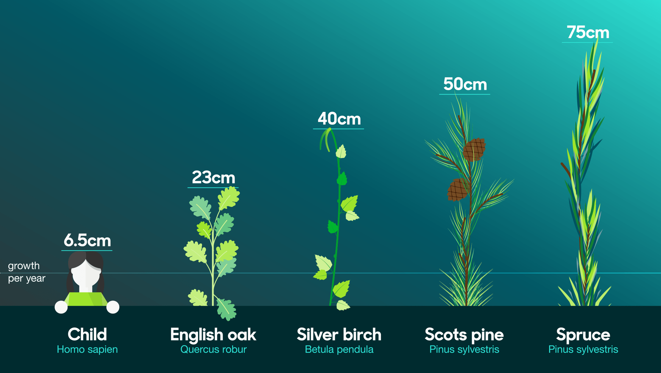
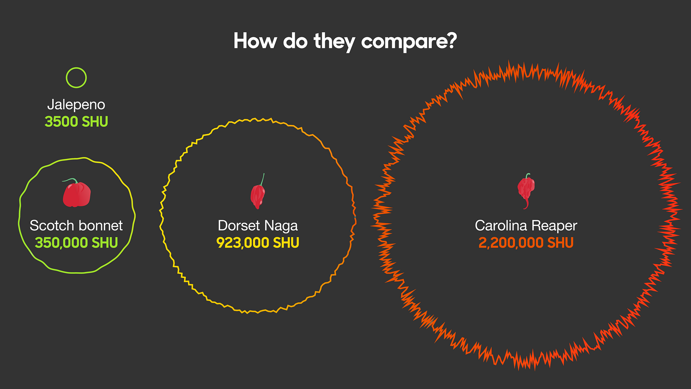
To delight and inform BBC’s audiences on social media, we created over 60 animated explainers that provide amazing answers to curious questions about the world we live in.

An animated GIF that begins with the question 'How much blood does my heart pump in the year?'. An animated heart and text reveals we pump 70 milliletres per beat, about 5 litres per minute or 300 litres for hour. Finally a swimming pool turns red as the text reveals that in a year it's enough to more than fill an olympic swimming pool.
An animated graphic comparing some of the highest mountain peaks. It shows Ben Nevis in Scotland at 1,344 metres. Everest in Nepal is 8,846 metres. And Olympus Mons on Mars is 25,000 metres.
A graphic comparing how much different plants grow per year with a human child's average growth per year for comparison. While a child grows at 6.5 centimetres per year, the four plants shown all grow more than this, with spruce growing 75 centimetres in the same time period.
A visualization comparing the scoville heat units (SHU) of some of the world's hottest chilli peppers. The hottest pepper is the Carolina Reaper at 2,200,000 SHU. For refernece, a regular Jalapeno is shown to be just 3500 SHU.


Survey results on social

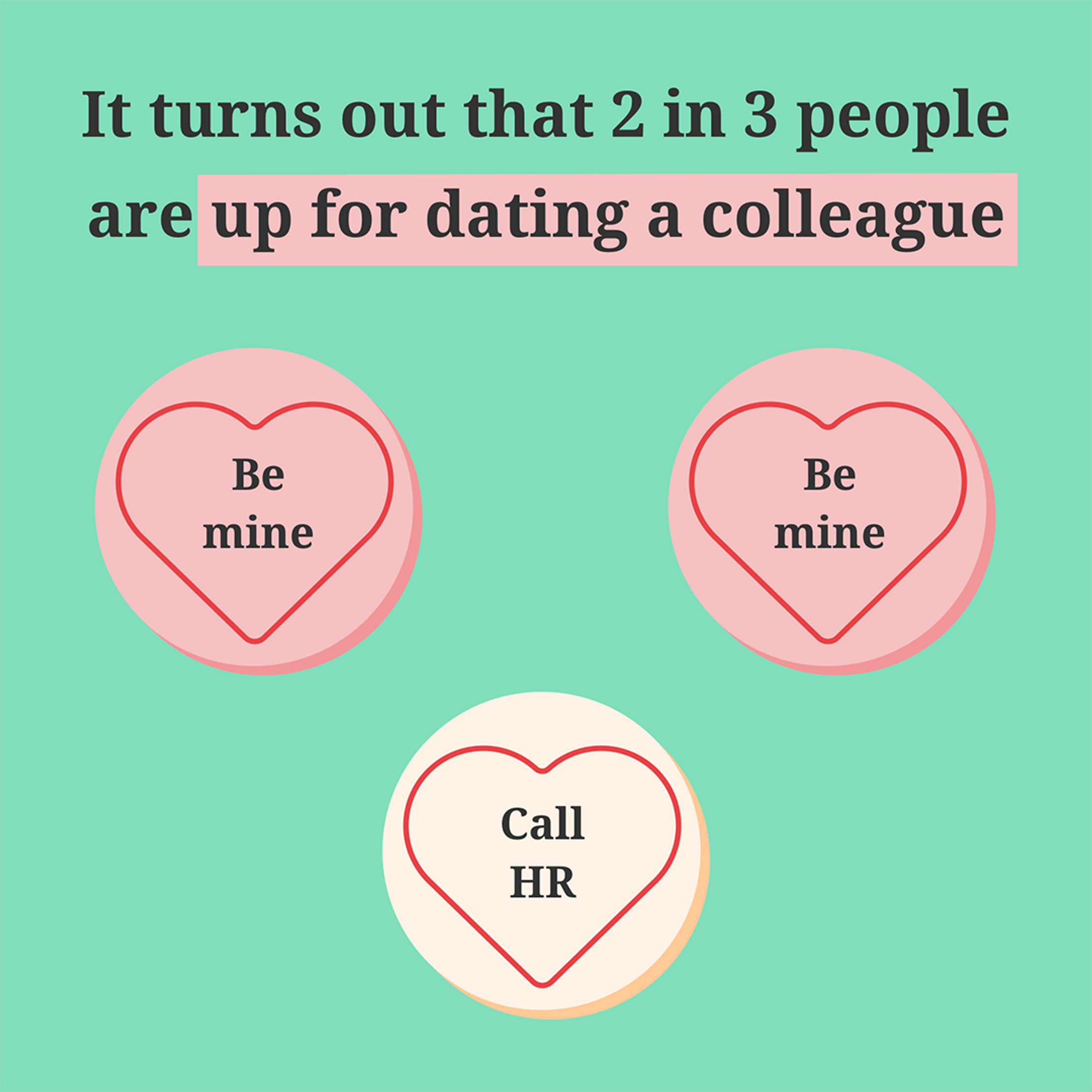
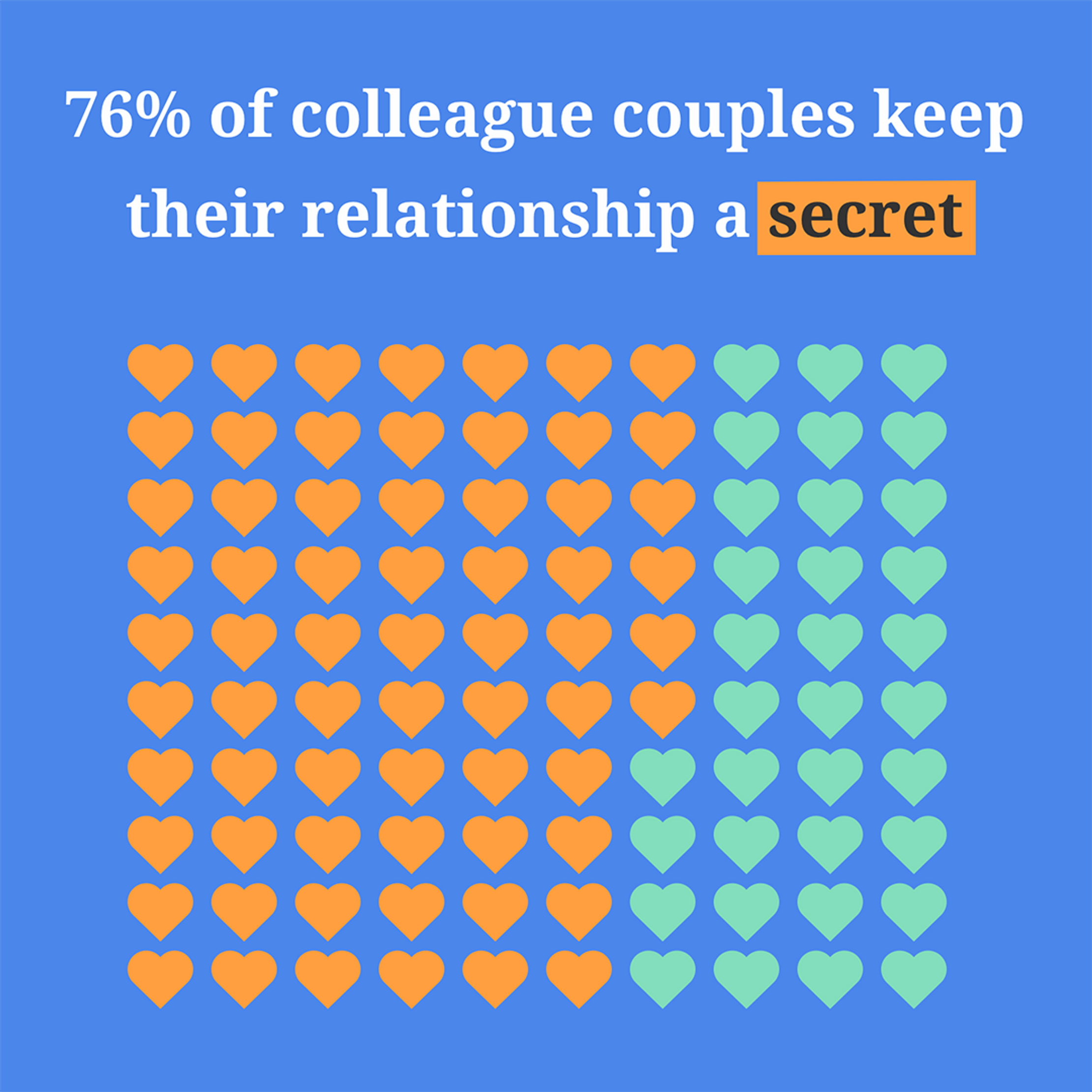
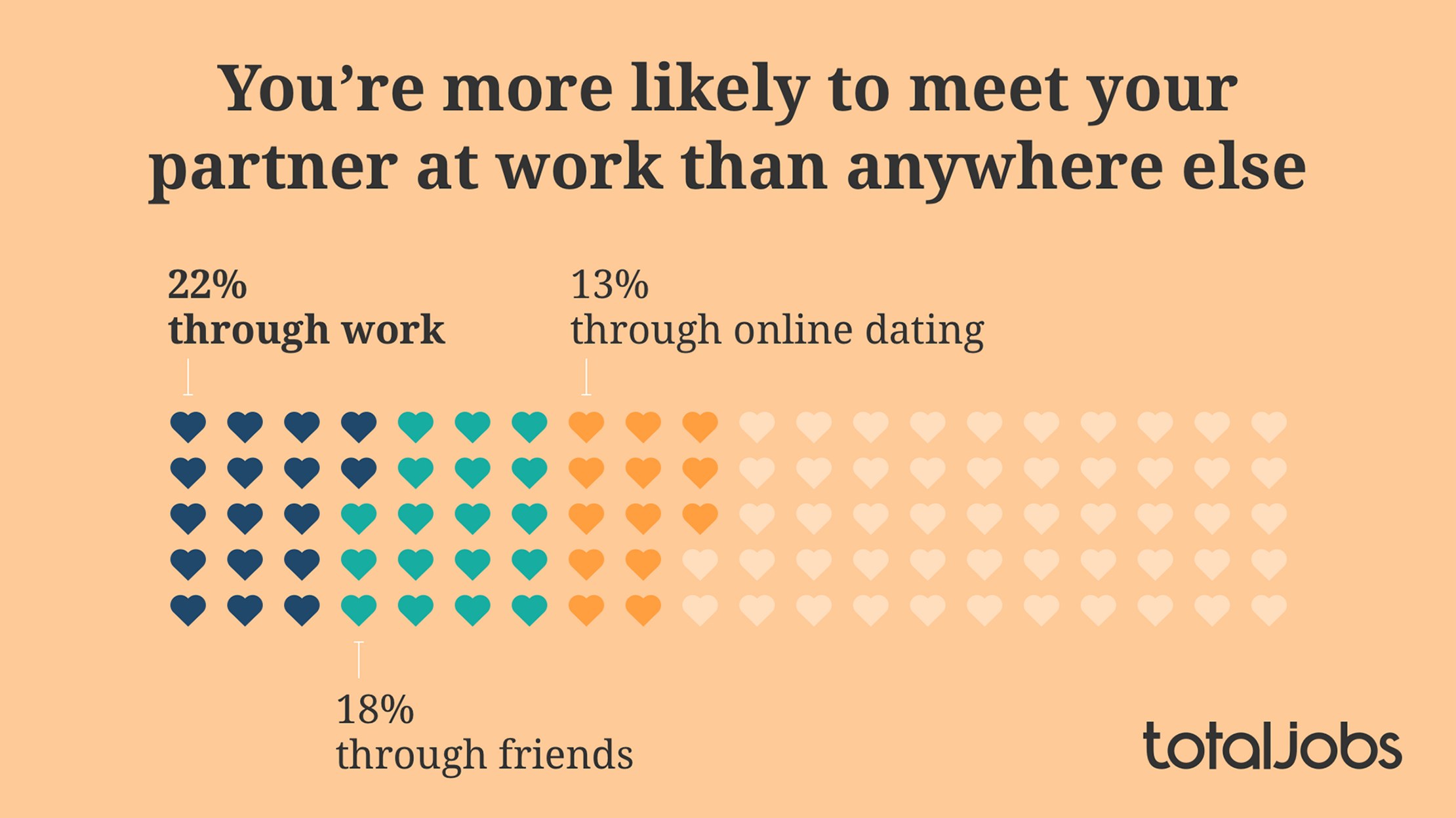
What did 5,000 UK workers reveal when surveyed about romance in the workplace?

We visualized some of the most eye-catching results as colourful social-media graphics to drive traffic to the client’s website.

A graphic with a statistic that reads: 'It turns out that 2 in 3 people are up for dating a colleague.' Below this are three love hearts in the shape of the popular candy. Two read 'Be mine'. The third reads 'Call HR.'
A graphic with a statistic that reads: '76% of colleague couples keep their relationship a secret'. Below this, a grid made of love hearts is 76% filled in.'
A graphic showing you're more likely to meet your partner at work than anywehere else. One hundred hearts sit on the graphic, with 13 representing 13% through online dating, 18% through friends and 22% through work.


Bringing a report to life

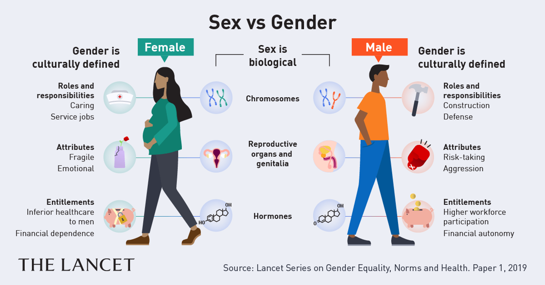
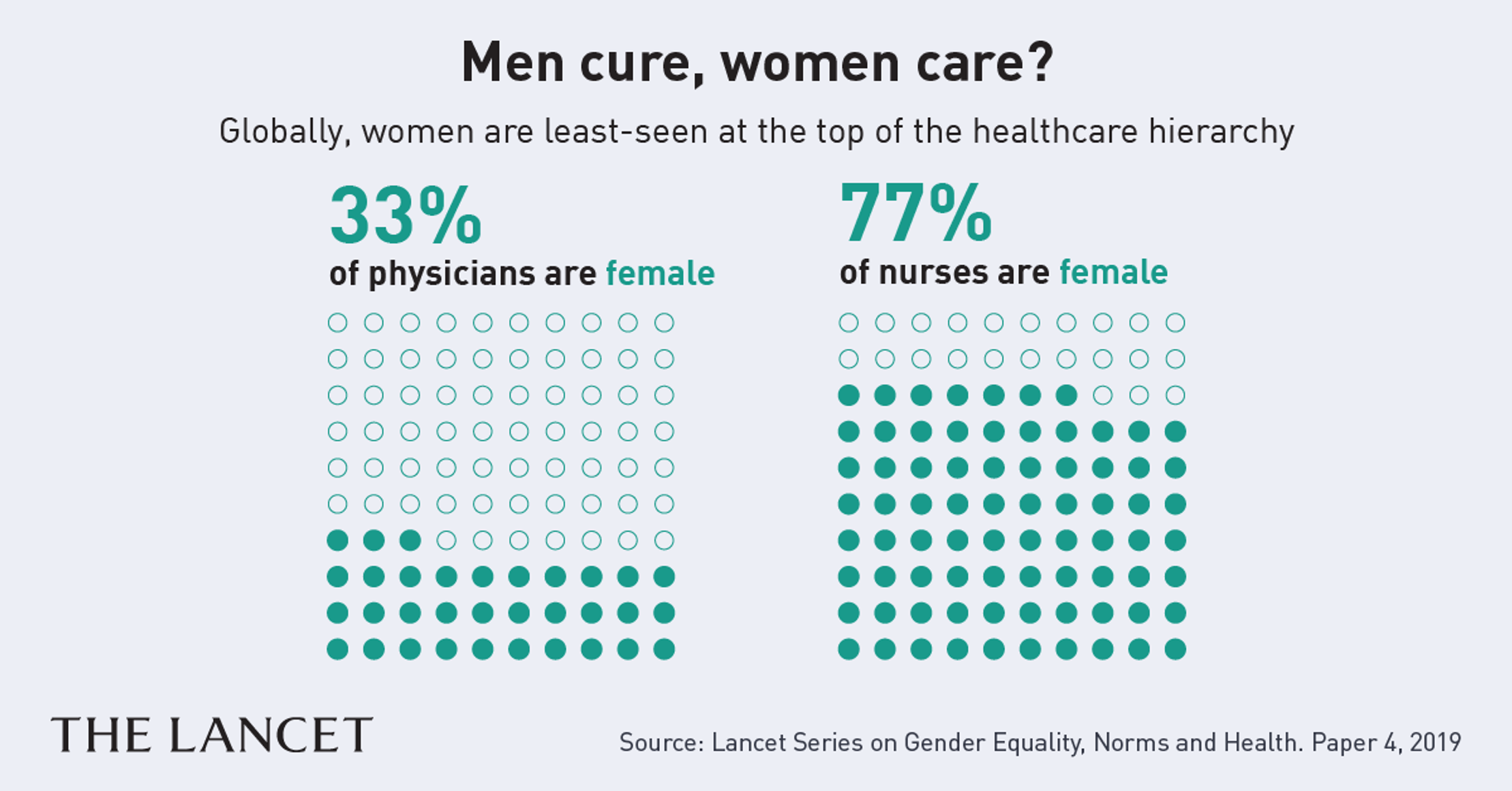
This series of social media graphics explains the key concepts, data and insights in a new The Lancet report on gender norms and health.

Thanks to simple charts and warm illustrations, they stand out and reward a closer look.

A graphic in a simple 2D style titled 'Sex vs Gender' that shows insights from the Lancet. It explains that sex is biological while gender is culturally defined.
A graphic based on research from the Lancet. It's titled 'Men cure, women care?' It reveals that globally women are least-seen at the top of the healthcare hierarchy. There are two plots of 100 dots each. On the first, 33 are shaded in with the title '33% of physicians are female'. The other grid of 100 dots has 77 filled in and is titled 77% of nurses are female.


Compact case studies

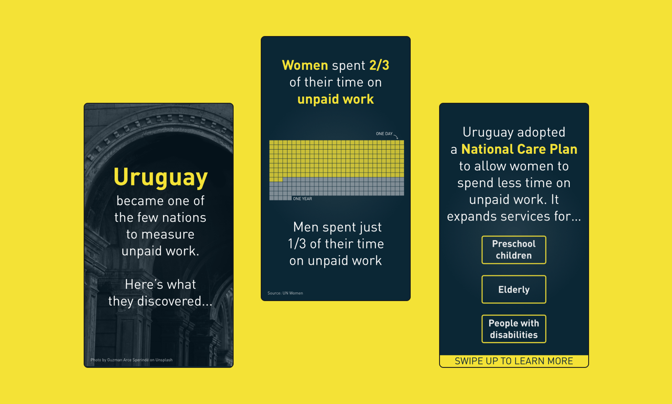
We used Instagram Stories to create a series of impactful micro-case-studies about gender equality to support Women Deliver’s 2019 global conference.

Users watch an auto-play slideshow to discover what happens when countries use gender data to drive policy and equality.

Three social media images in mobile portrait mode created to support Women Deliver's 2019 conference. The first is a title card, the second a data visualization comparing how much unpaid work men and women do in Uruguay and an explanation of the country's National Care Plan.

Get in touch:hello@beyondwordsstudio.com

beyond words logo
Follow us
TwitterInstagramLinkedInYouTube
Find us
Beyond Words Studio UK 91 Brick Lane London, E1 6QL
Beyond Words Studio US Florida, USA
Beyond Words Studio EU Dublin, Ireland
Copyright Beyond Words Studio Ltd. 2023