BBC Earth
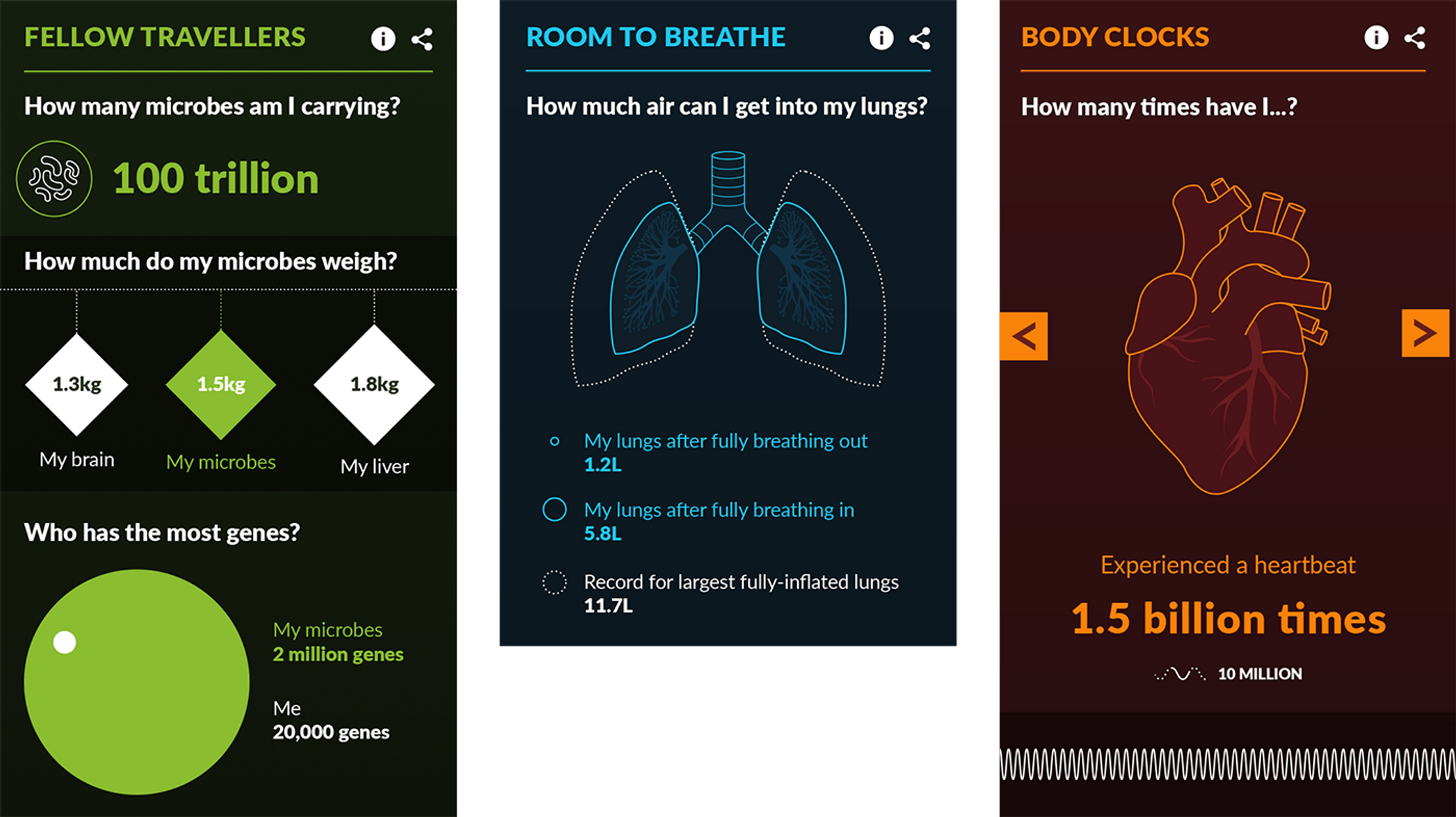
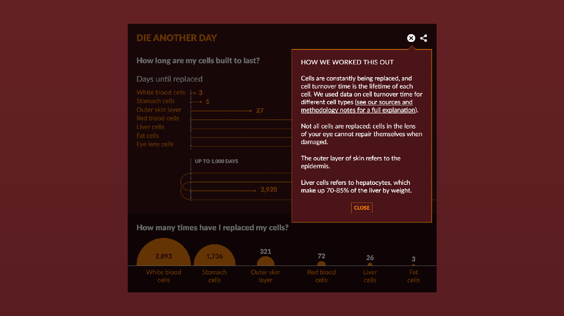
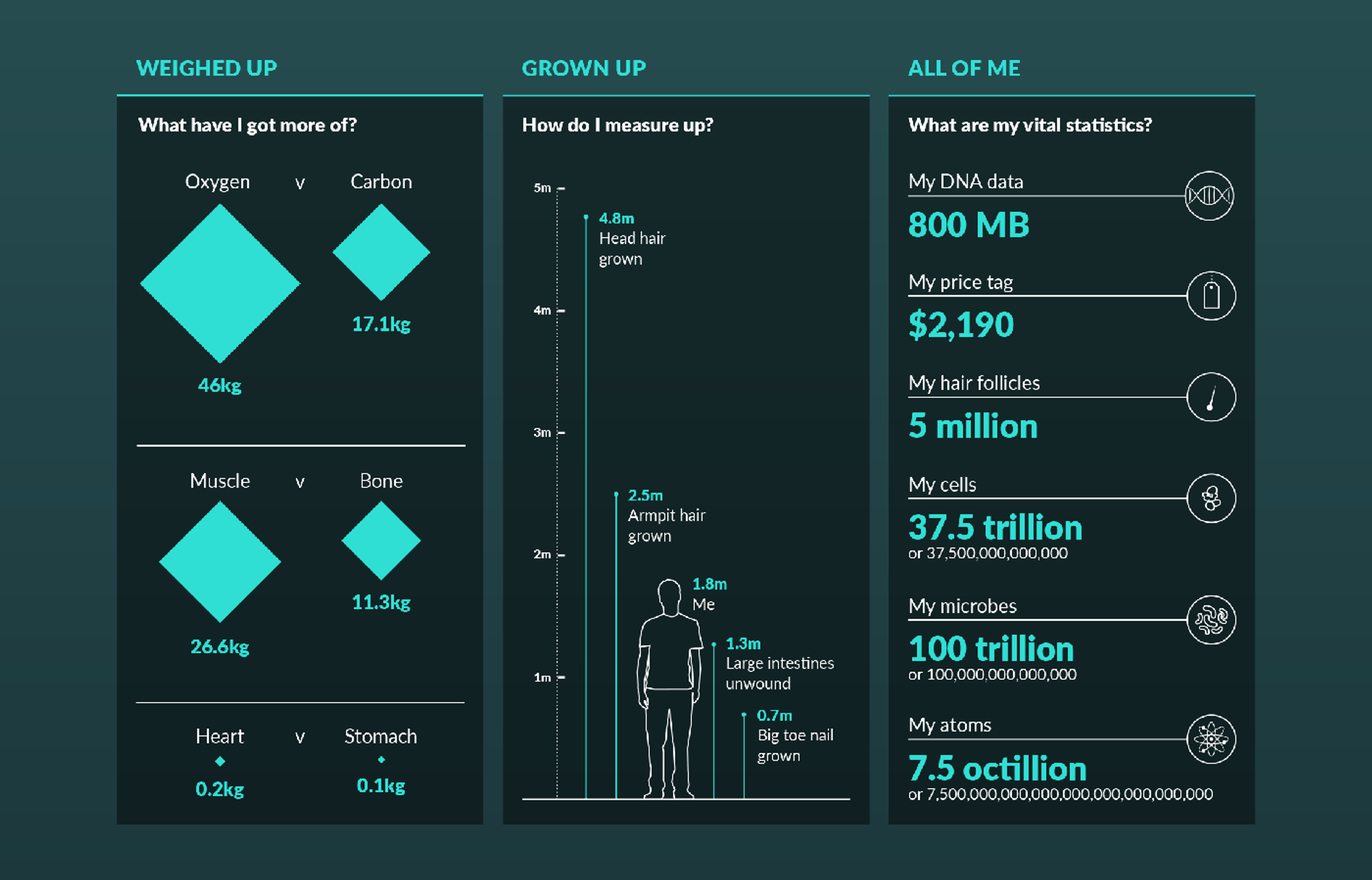
Ever wondered how many times you’ve blinked? How far your intestines could stretch? Or the amount of gas you’ve produced?
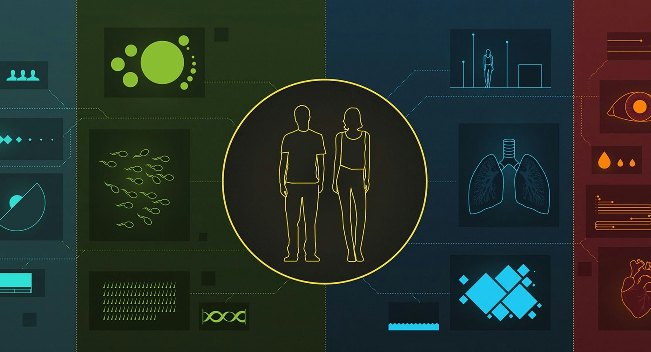
The BBC’s natural history brand wanted an interactive website that offered people a ‘data-driven look at their own bodies.
If readers shared their age, gender, height and weight, we could visualize their personalised data on a truly cellular level.
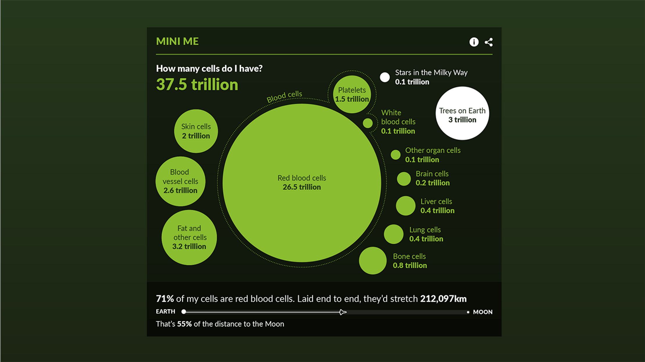
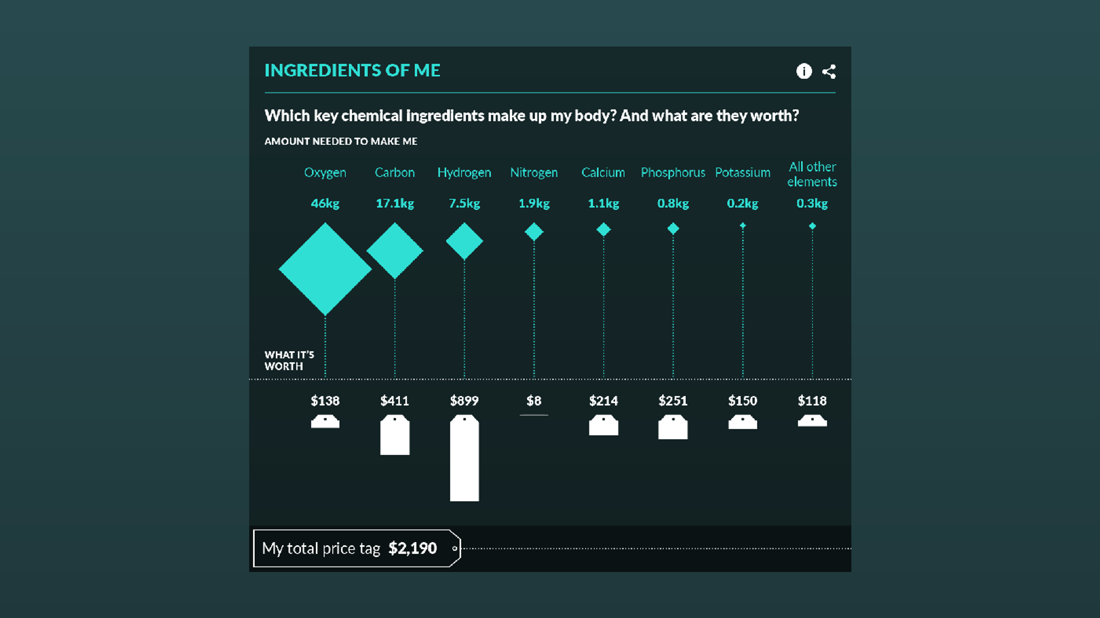
We did a deep dive into all the body-bits we thought made for interesting stories. For example, ’Body Shop’, which quantified the commercial value of our chemical makeup.
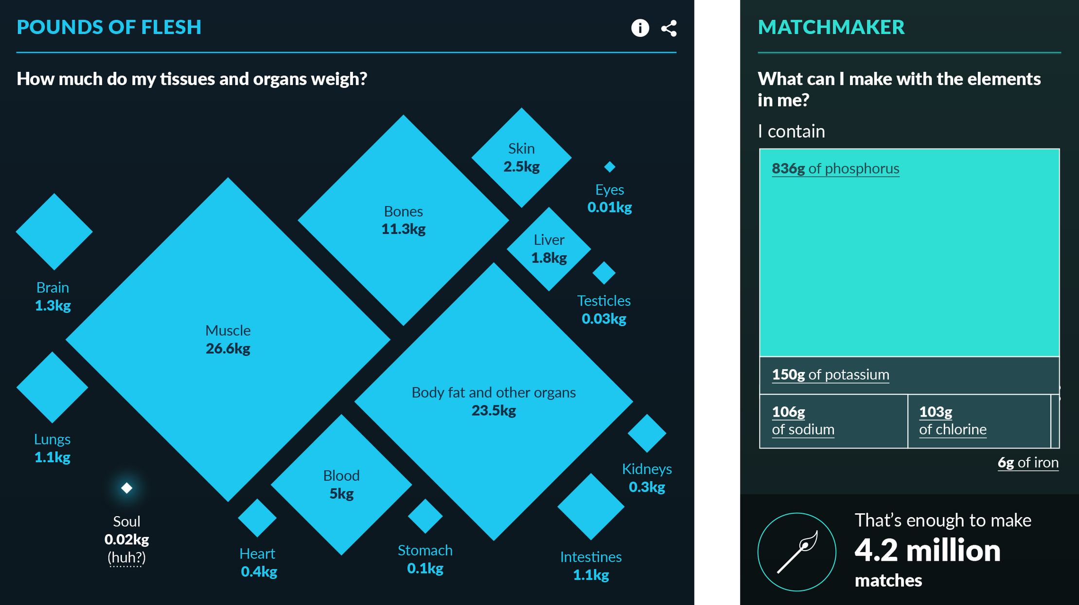
We found witty ways to dissect the data, like how many phone booths full of flatulence you’ve produced in a lifetime or how many matchsticks could be made with all the sulphur in your body.
The design’s modular structure meant the visualizations could shape-shift to work neatly on any device.
Subtle animations breathed life into our biology and we included elements of the BBC’s Global Experience Language (GEL) guidelines, ensuring the piece would transplant seamlessly into the overall site.
So if you've ever wondered how long your hair (or toenails) would have grown if left uncut since birth, look no further.

Get in touch:hello@beyondwordsstudio.com

