BBC Earth
To help promote and celebrate Life Story, BBC Earth asked us to create a data visualization that would fill people with awe and wonder about the natural world and wake audiences up to the realities of climate change.
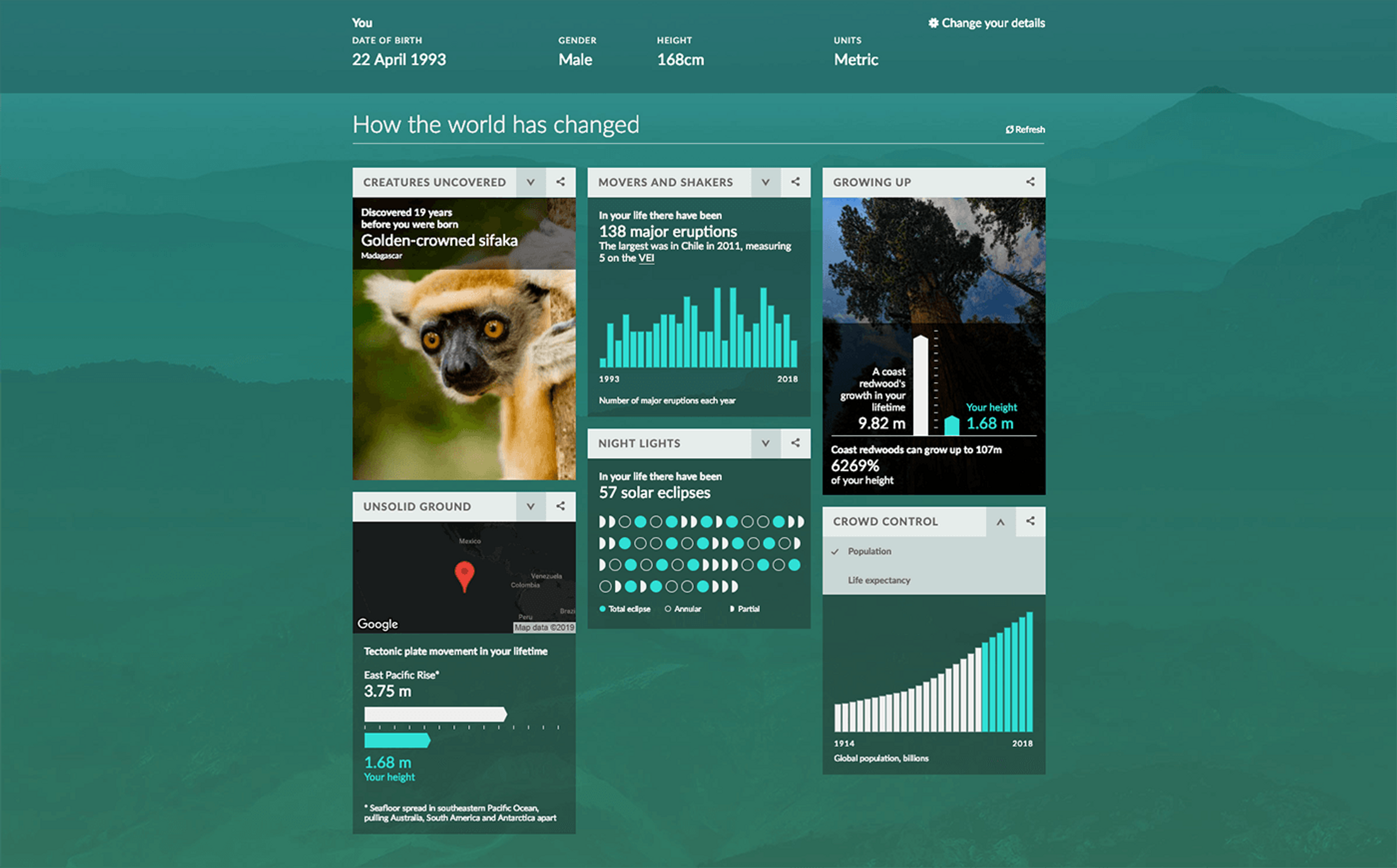
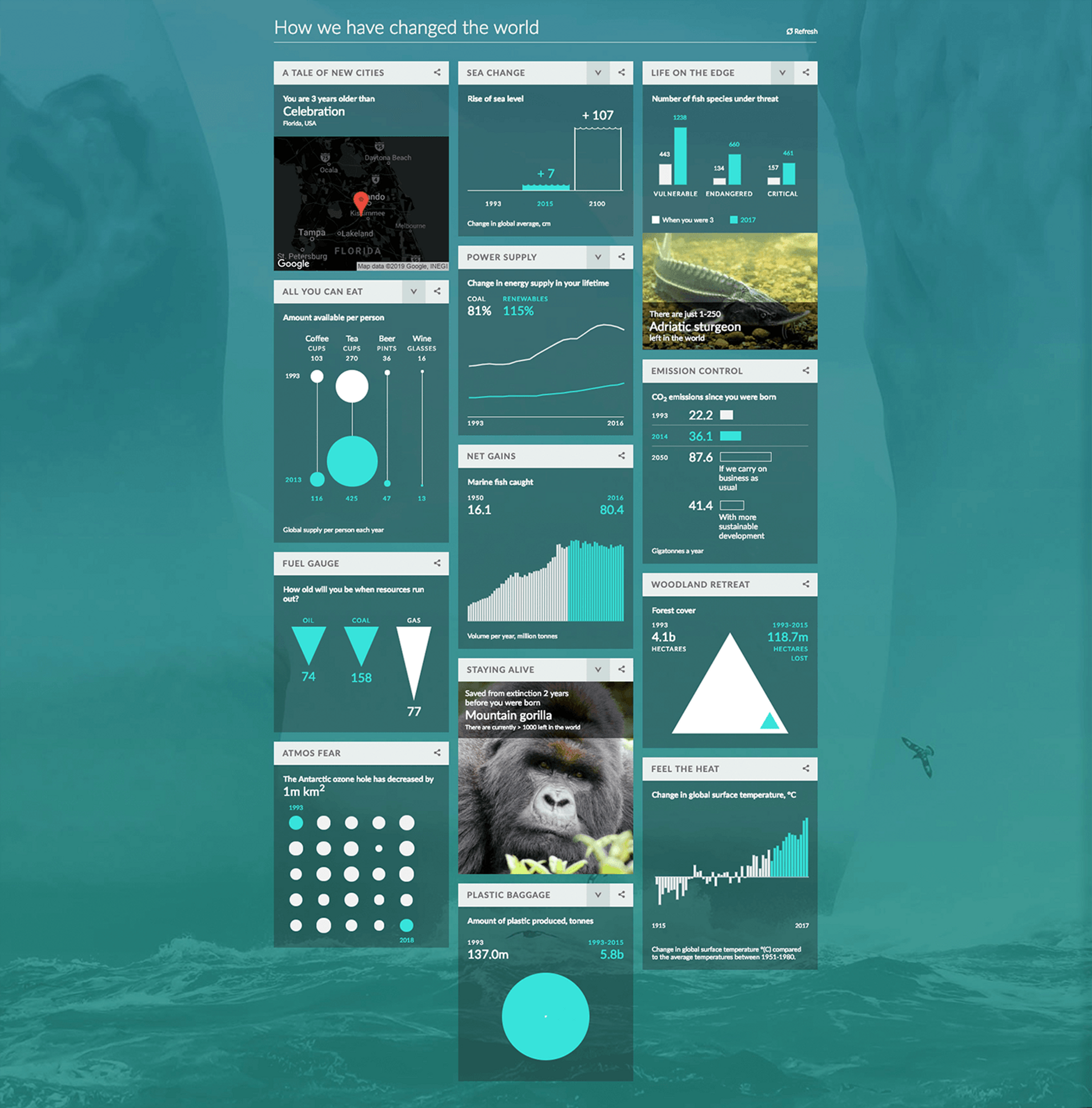
We created a personalised interactive page where readers could see exactly how much the Earth has changed during their lives.
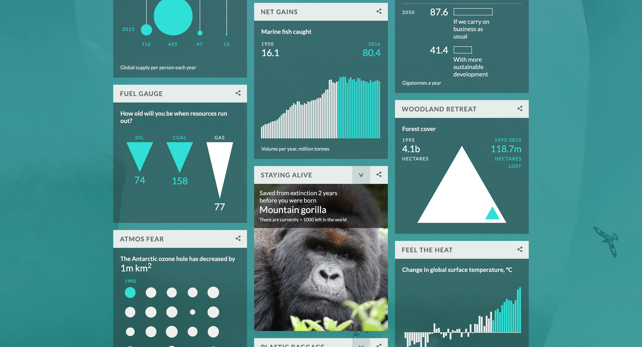
This was an opportunity to present oft-repeated (and ignored) climate change statistics in a powerful, personalised form. We also take the time to discuss important issues like rising global temperatures, receding sea ice and dwindling rainforests.
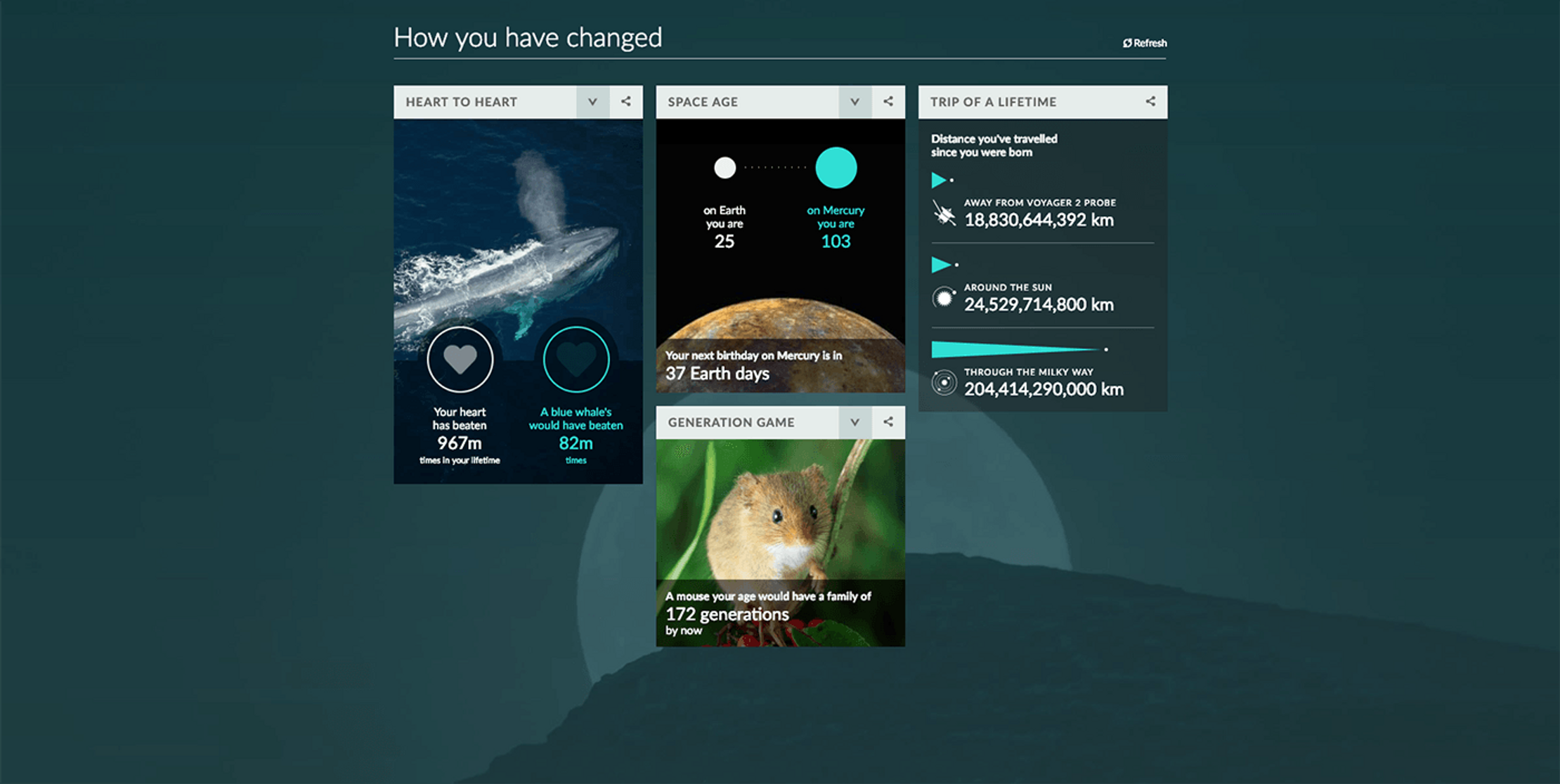
But it wasn’t all hard-truths. We were sure to include stories that could inspire and surprise readers like how high trees would have grown in their lifetime, or how old they’d be on other planets.
How did we fit volcanoes, supermoons and mountain gorillas together into a coherent story? We chose a modular approach, where each story exists independently, but come together on a page to reveal how the world has changed and how humans have changed the world.
These modules were mobile friendly and social-ready, and we included a personalised range of super-shareable tweets for readers to show the stories they particularly loved.
Get in touch:hello@beyondwordsstudio.com

A personalised, interactive, never-before-seen look at your body. What it’s made of. What it’s produced. And how you can count it all.

We took people on mind-expanding journeys to the edge of the solar system, the depths of the ocean and the core of the Earth.