Goalkeepers: Bill Gates’ speeches

These dynamic big-screen presentations helped Bill Gates to deliver an annual speech that’s designed to change the world.
Client

Bill & Melinda Gates Foundation

Project TypePresentations
A photograph taken of Bill Gates on stage speaking at a Goalkeepers. Behind him is a pie chart made of dots. Beneath his feet is the word 'Goalkeepers' in larger white letters.

In 2019, Bill Gates noted that nearly everyone listening to his speech on global poverty would have been dead in the 1800s.

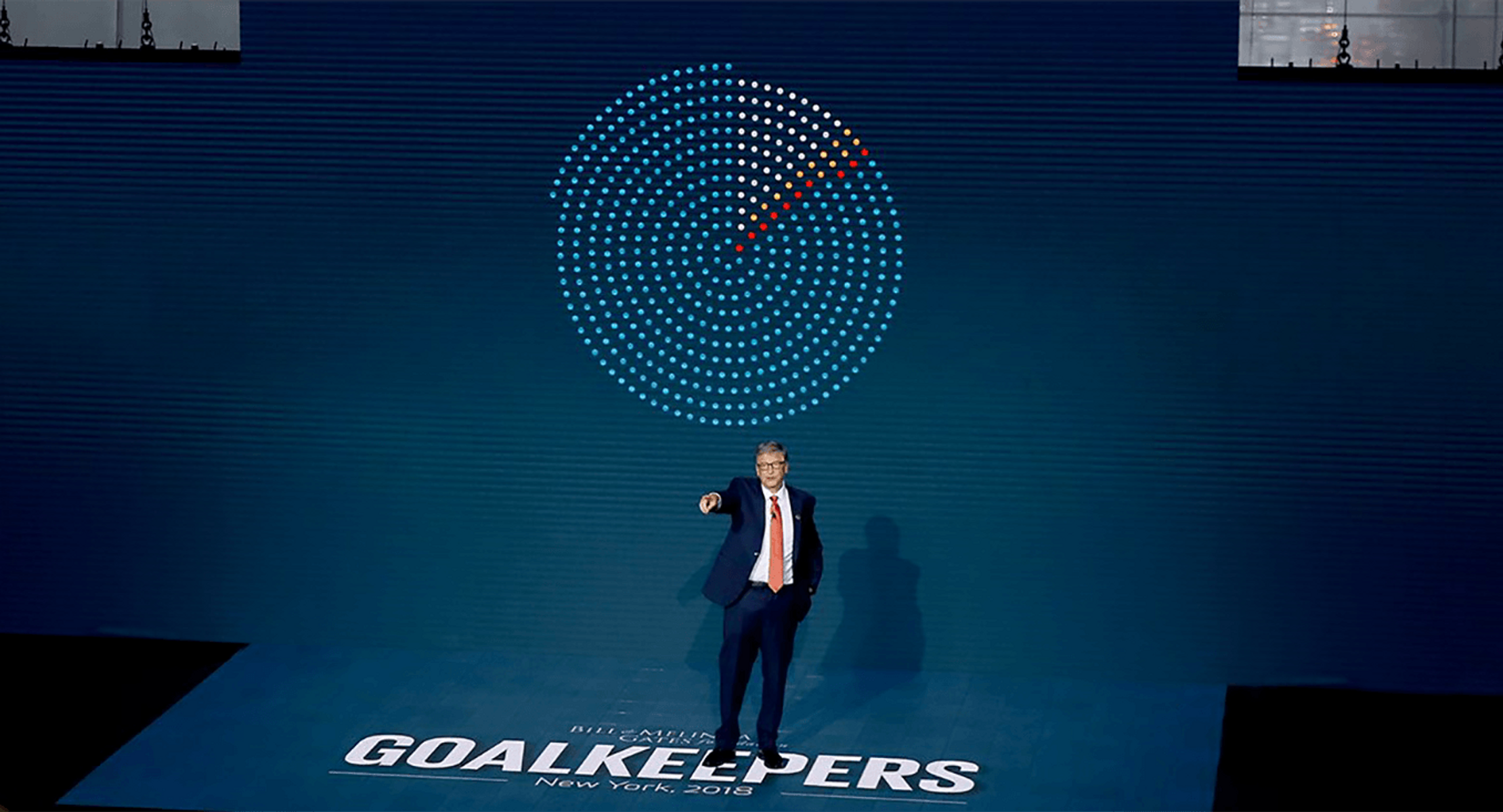
Behind him, our animations revealed the progress we’ve made and the developments that are still desperately needed.

In both 2018 and 2019, we provided the background animations for Bill Gates’ annual speech on global poverty.

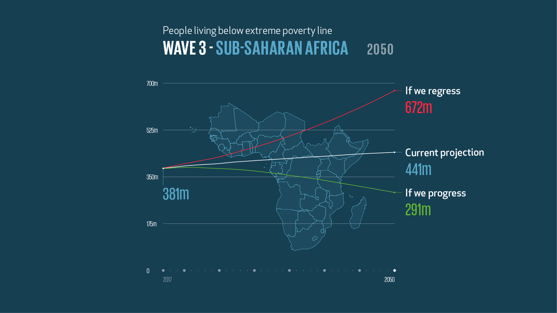
We used a simple, powerful visual approach: one dot to represent one million people. Flowing movement enabled the audience to see these clusters of dots growing, shrinking and shifting as Bill talked through the story.

We also needed to deep-dive into the stories of China, India and particularly sub-Saharan Africa, which is predicted to have over 75% of the world’s people living below the extreme poverty line by 2050.

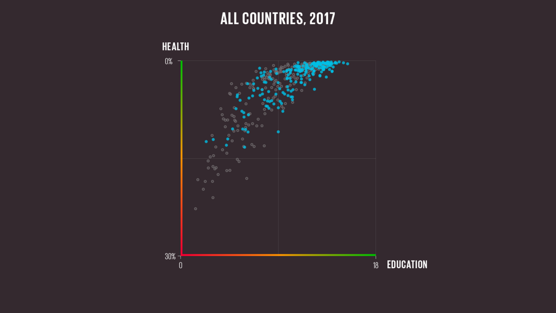
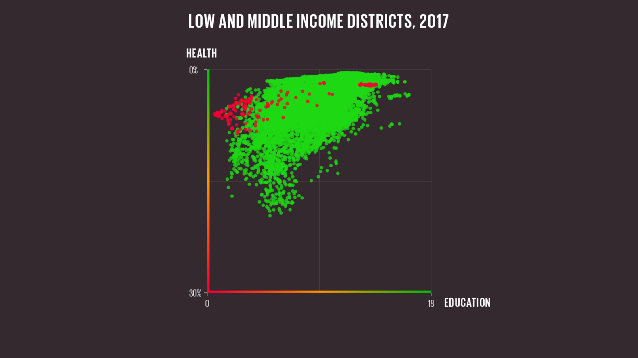
It was important to help the audience understand things quickly, so we created a scatterplot containing 17,000 dots and used simple colour-coding (green for good, red for bad) and axis gradients that made sense at a glance.

“Our foundation is focused on the belief that we shouldn’t have red dots or even yellow dots,” concluded Bill Gates. “We want every human being to have the basic opportunities that we take for granted. We need to change the odds.”

Goalkeepers 2018

A map of Sub-Saharan Africa sat behind a line chart showing the number of people that might be living below the poverty line in the region between 2017 and 2050. The line chart plots three scenarios: a current projection (441 million people), if we regress (672 million people) and if we progress (291 million people).


Goalkeepers 2019

A scatter plot showing the percentage of children that die before the age of five on the y-axis which spans 0% at the top to 30% at the bottom. The x-axis shows years of education from 0 to 18. The dots represent countries in 2017 with the majority slowly moving towards the favourable zone in the rop right.
A scatter plot where each dot is a subnational district in a low or middle income country in 2017. The y axis shows children dying before the 5 years old, at 30% at the bottom and 0% at the top. The x-axis shows years of education running from 0 to 18. Most countries in green indicate they improved in both areas. A few fots in red did not. These tend to be grouped more towards the low end of the x-axis for education.

Get in touch:hello@beyondwordsstudio.com

beyond words logo
Follow us
TwitterInstagramLinkedInYouTube
Find us
Beyond Words Studio UK 91 Brick Lane London, E1 6QL
Beyond Words Studio US Florida, USA
Beyond Words Studio EU Dublin, Ireland
Copyright Beyond Words Studio Ltd. 2023