World Bank

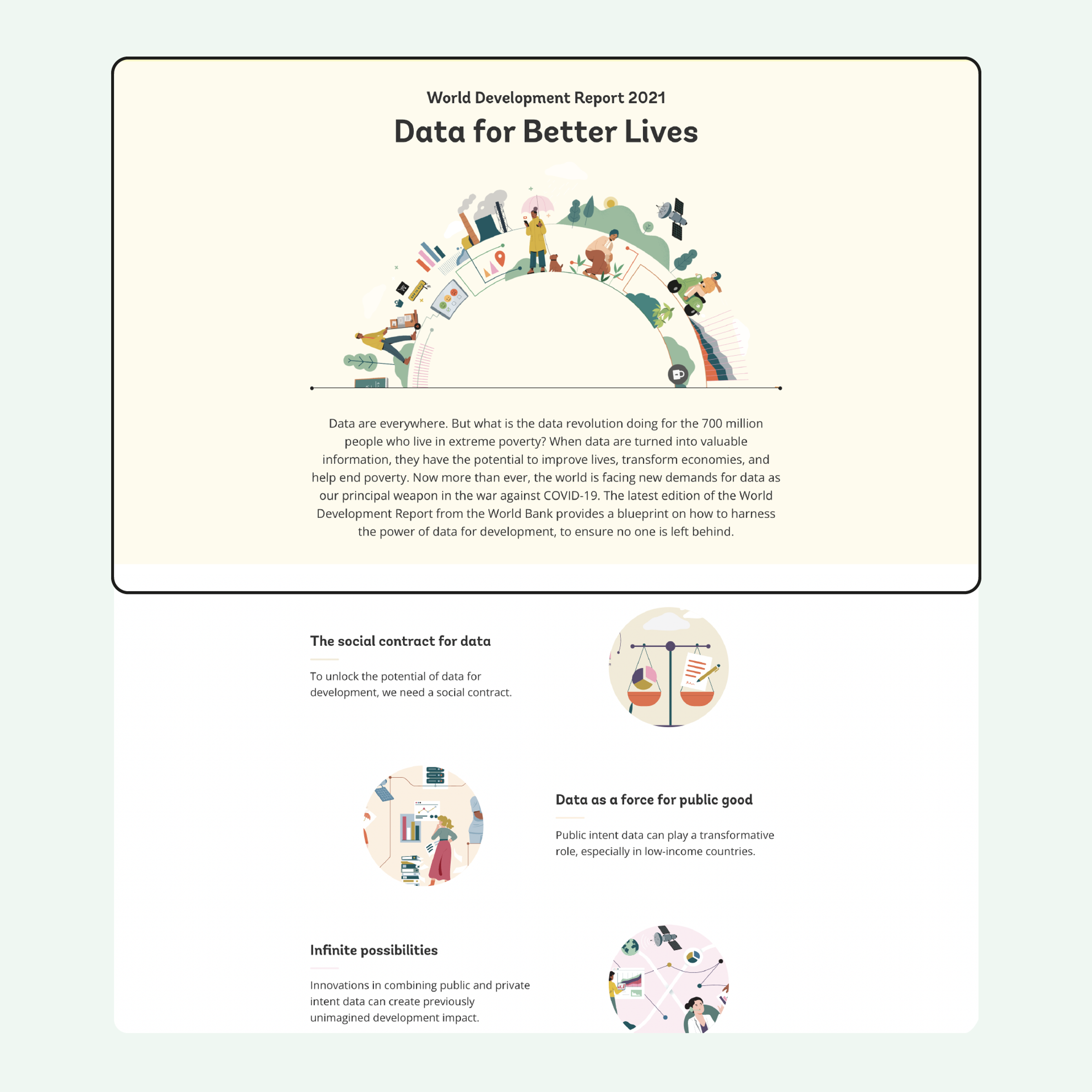
The 2021 edition of the World Development Report from the World Bank explains how data can improve the lives of poor people and advance development objectives.
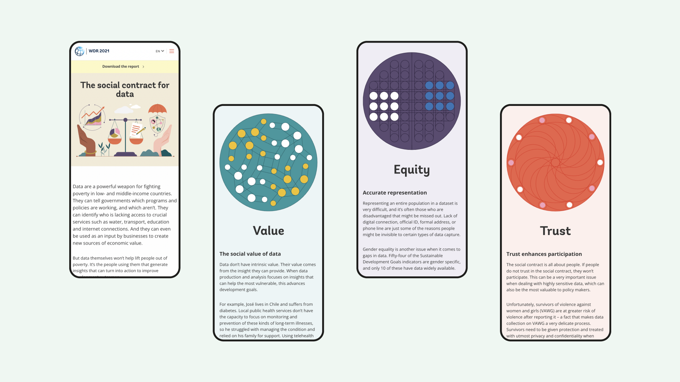
Working with fellow data viz experts Jan Willem Tulp and Maarten Lambrechts, we turned the report’s 350 pages into an engaging website and broke its biggest ideas down into nine digestible stories with animated visuals.
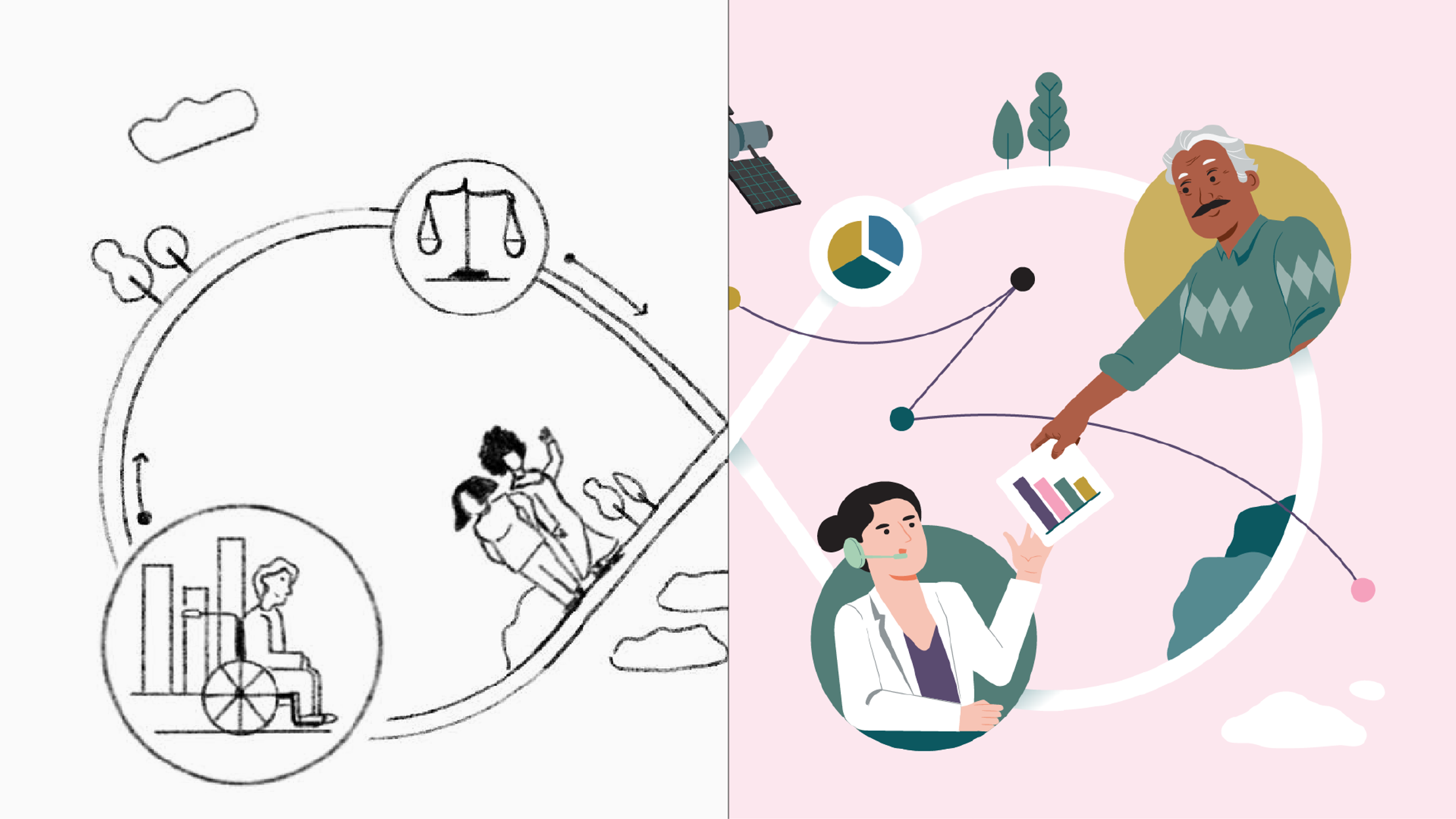
We loved the way the report’s original illustrations, created by Base Three Studio, reflected the real human lives behind the data. So we commissioned freelance illustrator Elisabetta Calabritto / Loveblood Creative to capture the same style and tie the pages together.
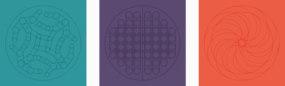
We also created a style guide for the team to follow for story pages and charts. With over 20 different types of data visualization, this aligned approach was crucial.
To help people understand the report’s more abstract concepts, we broke them down using scroll-triggered animations that build in the ideas frame-by-frame.
The entirety of the site design was pared back to let the illustrations really shine and touches of animation were brought in to engage readers even more.
Get in touch:hello@beyondwordsstudio.com

The UN Foundation asked us to tell the remarkable story of the second biggest single contributor to WHO's pandemic response.

A report to change the world. These vibrant publications chart our remarkable progress in the fight against global poverty.